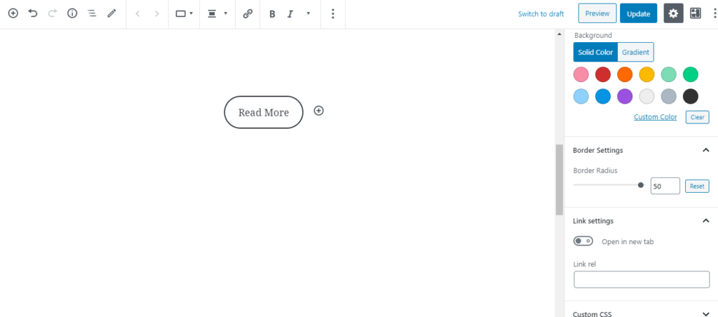
Let’s try to make Gutenberg Button block little interesting. In this quick tutorial, we will add an animated stip effect to the Gutenberg Button block.
Here is the sneak peek of what it will look like.

Take a buttons block and assign class btn.

Here is the magic CSS which you can use to apply this effect. No JS required. ?
.btn a{
  -webkit-transition: all .5s ease;
  transition: all .5s ease;
  overflow: hidden;
  position: relative;
}
.btn a:after {
  content: '';
  display: block;
  height: 7px;
  width: 100%;
  background-image: repeating-linear-gradient(45deg, #666, #666 1px,
  transparent 2px, transparent 5px);
  -webkit-backface-visibility: hidden;
  backface-visibility: hidden;
  border-top: 1px solid #666;
  position: absolute;
  left: 0;
  bottom: 0;
  background-size: 7px 7px;
}
.btn a:hover {
  background-color: #666;
  color: #fff;
  border-color: #000;
}
.btn a:hover:after {
  background-image: repeating-linear-gradient(45deg, #fff, #fff 1px,
  transparent 2px, transparent 5px);
  border-top: 1px solid #000;
  -webkit-animation: stripe-slide 12s infinite linear forwards;
          animation: stripe-slide 12s infinite linear forwards;
}


@-webkit-keyframes stripe-slide {
  0% {
    background-position: 0% 0;
  }
  100% {
    background-position: 100% 0;
  }
}
@keyframes stripe-slide {
  0% {
    background-position: 0% 0;
  }
  100% {
    background-position: 100% 0;
  }
}
And that’s it. Here is the result.

You can change some of the button styles and colors using the options available for the button block.

But, we needed to use custom CSS to apply the color to the Strip which is at the bottom. And also to adjust the hover colors.
All the CSS above has that already, let’s understand what part you need to change to adjust it to your preference.
To change the button color, we need to change color values from the .btn a:after , .btn a:hover & .btn a:hover:after as shown below.
.btn a:after {
 background-image: repeating-linear-gradient(45deg, #7d1fd4, #7d1fd4 1px, transparent 2px, transparent 5px);
 border-top: 1px solid #7d1fd4;
}
.btn a:hover {
  background-color: #7d1fd4;
  border-color: #2c0073;
}
.btn a:hover:after{
 border-top: 1px solid #2c0073;
}
Note the part we have adjusted to change the colors. The above code is not complete, this just shows the properties we needed to change. Make sure you adjust it in the main complete code provided earlier.

That’s it. You can go creative and apply some more CSS to make it even better.

Hope you like it. keep visiting for more tutorials like this. ☺️


Leave a Reply