This tutorial will cover the complete Gutenberg scrollable gallery block creation. This won’t be a beginner-friendly tutorial. If you’re new to Gutenberg blocks development, first check out, How to Create Custom Gutenberg Block for WordPress – The Beginners Guide.
Pre-requisites
Before following this tutorial, make sure you have the following pre-requisites.
- Scaffolded Gutenberg block: An already scaffolded Gutenberg block
if you don’t know how to scaffold a Gutenberg block, You can follow this tutorial, “How to Create Custom Gutenberg Block for WordPress – The Beginners Guide”
- Some Basic React Knowledge: As Gutenberg is completely based on react.js, you must have some basics covered about react.js.
What are we going to build?
When following a how-to tutorial, It’s important to know upfront what the tutorial’s final result will achieve. Here’s what we’re going to create.
Here’s a block preview from the front end.

Planning block options
When developing a Gutenberg block, It’s crucial to plan what functionalities a block will have. In our case, the scrollable gallery block will have the following general configuration options.
- Pause on hover
- Direction
Let’s cover each configuration option sequentially.
Option 1: Pause on hover
This configuration option allows users to toggle the auto-pause behavior when the user hovers on the scrollable gallery with a cursor.
Option 2: Direction
This configuration option allows the user to specify the animation direction for the scrollable gallery. Currently, we’re going to cover two available directions in this tutorial:
Left Direction
Right Direction
💡 Quick Task: Try adding “up” and “down” directions yourself after covering this tutorial to improve your skills.
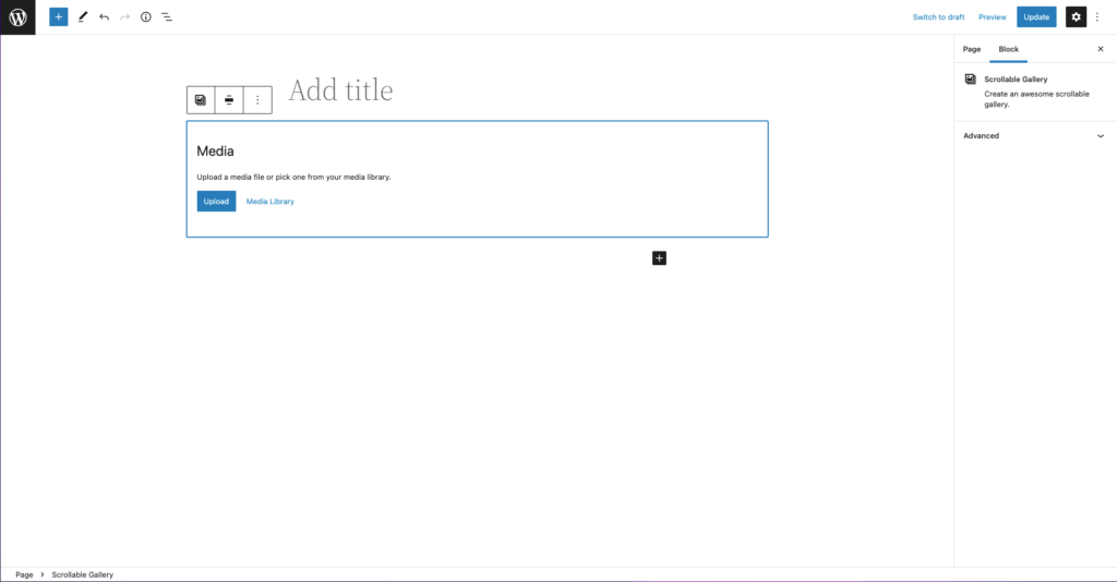
Creating the block placeholder
I think it’s always great to use some placeholder in your Gutenberg block. The block placeholder provides some benefits when it comes to user experience. It acts as a starting point for your Gutenberg block and prompts the user to take the necessary steps to set up the block.
In our case, selecting the media images is the necessary action required to set the block up.
Gutenberg provides different types of placeholder components for you to use. For our scrollable image gallery, we’re going to use MediaPlaceholder, which comes with the pre-built functionality of media inputs, so we don’t have to create the functionality from scratch.
import { MediaPlaceholder } from "@wordpress/block-editor";Using the media placeholder in our block.
// src/edit.js
export default function Edit(props) {
	return (
		<>
			<div {...useBlockProps()}>
				<MediaPlaceholder multiple gallery />
			</div>
		</>
	);
}
Here’s how the block should be in Gutenberg editor.
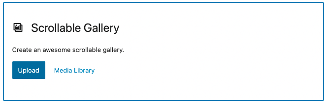
Let’s modify our placeholder to contain labels and instructions reflecting our scrollable gallery block. As with any other react component, Media Placeholder can be modified with the help of certain props.
You can read the documentation regarding the placeholder here on Github.
// src/edit.js
import { BlockIcon } from "@wordpress/block-editor";
Now, we can modify our placeholder (like below) to add a label and instructions with the help of props.
// src/edit.js
export default function Edit(props) {
	return (
		<>
			<div {...useBlockProps()}>
				<MediaPlaceholder
					multiple
					gallery
					icon={<BlockIcon icon="format-gallery" />}
					labels={{
						title: "Scrollable Gallery",
						instructions: "Create an awesome scrollable gallery.",
					}}
				/>
			</div>
		</>
	);
}
The placeholder should now contain all the necessary details for our scrollable gallery.
Handling Image inputs
Currently, our block won’t do anything when the user inputs some images from the media gallery. Let’s work on handling image inputs now.
Registering image attribute
Before we handle image inputs functionality, we need some way to store selected images in our block; We can store block data using Gutenberg block attributes; let’s quickly register an attribute for images.
// block.json
{
    "attributes": {
        "images": {
            "type": "array",
            "default": []
	}
}
Handling input events
It’s time to handle image input events from our media placeholder and do make necessary changes accordingly. In our case, we need to store those selected images in our recently registered block attribute.
We can use “onSelect” prop in our media placeholder to handle image selection.
<MediaPlaceholder
    multiple
    gallery
    icon={<BlockIcon icon="format-gallery" />}
    labels={{
        title: "Scrollable Gallery",
        instructions: "Create an awesome scrollable gallery.",
    }}
    onSelect={(newImages) => props.setAttributes({ images: newImages })}
/>
Adding a way to edit the gallery
Currently, the user will be bound with the selected images from the initial placeholder, as there is no other way to edit these selected images. Therefore, let’s add a toolbar control that allows users to modify the gallery quickly.
import { BlockControls } from "@wordpress/block-editor";We can use Gutenberg slot fill “BlockControls” to add some toolbar controls.
import { ToolbarButton, ToolbarGroup } from "@wordpress/components";
import { MediaUpload, MediaUploadCheck } from "@wordpress/block-editor";
Now, using the slot fills and the components above to create a toolbar control that allows the user to edit the current gallery.
// src/edit.js - inside edit function
<BlockControls>
    <ToolbarGroup>
        <MediaUploadCheck>
            <MediaUpload
                multiple
                gallery
                addToGallery={true}
                onSelect={(newImages) =>
                    props.setAttributes({ images: newImages })}
                allowedTypes={["image"]}
                value={props.attributes.images.map((image) => image.id)}
                render={({ open }) => (
                    <ToolbarButton onClick={open}>
                        {__("Edit Gallery", "scrollable-gallery")}
                    </ToolbarButton>)}
            />
        </MediaUploadCheck>
    </ToolbarGroup>
</BlockControls>
Working for rendering gallery images
Still, our block won’t do anything when selecting media images (except it only stores images in the attribute behind the scene) in the UI. Let’s take some necessary actions when the images are selected in the UI.
Conditionalizing the block placeholder
Before rendering the selected images, we need first to conditionalize the initial block placeholder. Here are some visibility conditions we need to apply to the block placeholder.
| Condition | Should Display Placeholder? |
| When images are not selected | Yes |
| When images are selected | No |
Let’s create a constant just above the return statement in the edit function, which will store a condition (just for the sake of readability) that will evaluate a boolean value. "true" if the block contains images, otherwise "false"
// edit.js
const hasImages = props.attributes.images.length > 0;
Now let’s use this constant to conditionalize our media placeholder.
// edit.js
<div {...useBlockProps()}>
    {!hasImages && (
        <MediaPlaceholder
            multiple
            gallery
            icon={<BlockIcon icon="format-gallery" />}
            labels={{
                title: "Scrollable Gallery",
                instructions: "Create an awesome scrollable gallery.",
            }}
            onSelect={(newImages) => props.setAttributes({ images: newImages })}
        />
    )}
</div>
Currently, these changes will render the block completely empty when the images are selected, Because, in the current stage, our block only contains the placeholder. Please follow along with the next step which resolves this issue.
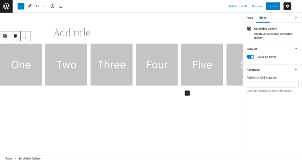
Rendering Images
It’s time to render these stored images somehow in the block, which will indicate to the user that images are selected successfully.
💡Quick Tip: Use HTML <figure> tag to represent elements that are related to each other.
export default function Edit(props) {
	const hasImages = props.attributes.images.length > 0;

	return (
		<>
			<div {...useBlockProps()}>
				{hasImages && (
					<figure className="scrollable-gallery-inner-container">
						{props.attributes.images.map((image, index) => (
							<img key={index} src={image.url} />
						))}
					</figure>
				)}
				{!hasImages && (
					<MediaPlaceholder
						multiple
						gallery
						icon={<BlockIcon icon="format-gallery" />}
						labels={{
							title: "Scrollable Gallery",
							instructions: "Create an awesome scrollable gallery.",
						}}
						onSelect={(newImages) => props.setAttributes({ images: newImages })}
					/>
				)}
			</div>
		</>
	);
}
Here is how the block should behave in the backend (editor) at the current stage.
Let’s quickly add some necessary styling for the gallery.
/** editor.scss **/
.wp-block-create-block-scrollable-gallery {
	.scrollable-gallery-inner-container {
		display: flex;
		flex-direction: row;
		overflow-x: scroll;
		margin: 0;

		img {
			object-fit: cover;
			&:not(:last-child) {
				margin-right: 16px;
			}
		}
	}
}Finalizing basic frontend block behavior
Now that we’ve made some good progress for the block in Gutenberg editor let’s leave the editor area for now and finalize some basic work for the block on the front end.
let’s start by creating markup for the frontend block; we need to duplicate images in order to create a continuous looped effect.
// src/save.js - inside save function

export default function save(props) {
	let blockProps = useBlockProps.save({
		className: "scrollable-gallery",
		style: {
			"--total-container-transform": ((props.attributes.images.length + 1) * 16)
				.toString()
				.concat("vw"),
		},
	});

	return (
		<div {...blockProps}>
			<figure className="scrollable-gallery-inner-container" data-direction="right">
				{props.attributes.images.map((image, index) => (
					<img key={index} src={image.url} data-mediaid={image.id} />
				))}

				{props.attributes.images.map((image, index) => (
					<img
						className="duplicate-image"
						key={index}
						src={image.url}
						data-mediaid={image.id}
					/>
				))}
			</figure>
		</div>
	);
}
let me explain the code above. Basically, we’re generating a static markup for our block in the frontend view.
We’re also creating a “--total-container-transform” variable that basically holds a calculated value of the amount of transform a container will have based on the total image length (multiplying it by 16 as each image will have max-width 16vw).
We’ve also added a data-direction="right” attribute on the main figure tag, which basically holds the current animation direction (currently, it’s hardcoded to “right”).
Now, let’s style block and add some CSS animations based on the direction.
/** style.scss **/
.scrollable-gallery {
	overflow: hidden;
	position: relative;

	.scrollable-gallery-inner-container {
		display: flex;

		&[data-direction="left"] {
			animation: marquee-left 5s linear infinite;
		}

		&[data-direction="right"] {
			animation: marquee-right 5s linear infinite;
		}

		img {
			object-fit: cover;
			height: 100%;
			min-width: 16vw;
			&:not(:last-child) {
				margin-right: 16px;
			}
		}
	}
}

@keyframes marquee-left {
	0% {
		transform: translateX(0%);
	}
	100% {
		transform: translateX(calc((-1 * var(--total-container-transform))));
	}
}

@keyframes marquee-right {
	0% {
		transform: translateX(calc(-1 * var(--total-container-transform)));
	}
	100% {
		transform: translateX(0%);
	}
}
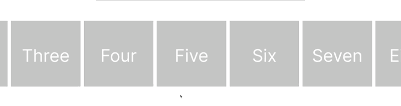
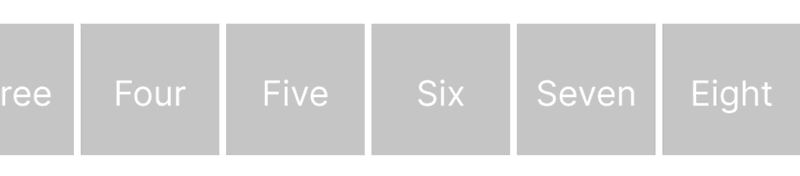
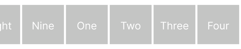
This is how the block should behave on the front end.
Working for configuration options
Now that we’ve made some progress in both (editor and frontend). Let’s work on some configuration options. In order to organize the tutorial, I am going to split each configuration option into 3 parts.
- Registering the attribute: Registering necessary block attributes for the required configuration option.
- Creating the User Controls: Creating the control responsible for taking user input.
- Implementation: Implementing the configuration on the front-end.
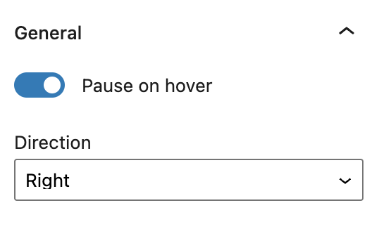
1. Pause on hover
Registering the attribute
Let’s register the boolean (as it can only contain true/false) attribute for this certain configuration option.
// block.json - Inside attributes definition
{
    "pauseOnHover": {
        "type": "boolean",
        "default": false
    }
}
Creating the User Controls
For this particular configuration option, we’re going to use a built-in WordPress “ToggleControl” component.
import { InspectorControls } from "@wordpress/block-editor";
import { ToggleControl, PanelBody } from "@wordpress/components";
As it’s the first configuration option. We’re also going to create a new panel that’ll group our general controls.
// src/edit.js - Inside edit function
<InspectorControls>
    <PanelBody title={__("General", "scrollable-gallery")} initialOpen>
    <ToggleControl
        checked={props.attributes.pauseOnHover}
        label={__("Pause on hover", "scrollable-gallery")}
        onChange={() =>
            props.setAttributes({
                pauseOnHover: !props.attributes.pauseOnHover,
            })
        }
    />
    </PanelBody>
</InspectorControls>
Implementation
Let’s add a dynamic class based on this particular attribute on the front-end.
// src/save.js - inside save function
let blockProps = useBlockProps.save({
		className: [
			"scrollable-gallery",
			props.attributes.pauseOnHover ? "pause-on-hover" : null,
		],
		style: {
			"--total-container-transform": ((props.attributes.images.length + 1) * 16)
				.toString()
				.concat("vw"),
		},
	});
Now, add the necessary CSS to pause the scrollable gallery on hover (when needed).
/** src/style.scss - Inside main scrollable gallery scss declaration **/
&.pause-on-hover {
		.scrollable-gallery-inner-container:hover {
			animation-play-state: paused;
		}
}
2. Direction
Right Direction
We’ve already added the particular styles required for this configuration option above. Now, let’s dynamically add the animation direction based on user requirements.
Registering the attribute
Let’s register an attribute for animation direction along with “enum” validation.
// block.json - Inside attributes definition
{
    "direction": {
        "type": "string",
        "default": "left",
        "enum": [
            "left",
            "right"
        ]
    }
}
Creating the User Controls
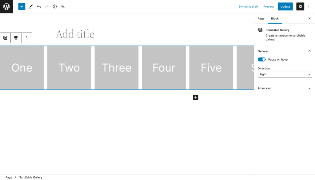
We’re going to use built-in “SelectControl” for our animation direction option.
import { SelectControl } from "@wordpress/components";// src/edit.js - Inside edit function, after toggle control.
<SelectControl
value={props.attributes.direction}
options={[
{ value: "right", label: "Right" },
{ value: "left", label: "Left" },
]}
label={__("Direction", "scrollable-gallery")}
onChange={(newDirection) => props.setAttributes({ direction: newDirection })}
/>Implementation
Now, let’s use this attribute to define our animation direction dynamically.
// src/save.js - attribute on main figure tag
<figure data-direction={props.attributes.direction}>
...
</figure>
Got Questions?
I tried to explain as much as possible; however, please comment below if anything isn’t clear.


Leave a Reply