In this tutorial, I’ll cover how to create a WordPress Gutenberg block that displays an unsplash image. This Gutenberg block allows you to generate a random image from unsplash and use it on your post/page. This unsplash block can be quite useful when you may need some random image on your site.
Final Result
Before you start following a how-to, it’s important to know what the end result will look like.
Pre-requisites
Here are some pre-requisites you may want to check out before proceeding with this tutorial.
- Scaffolded Block: An already scaffolded gutenberg block, follow this guide if you don’t know how to scaffold a gutenberg block.
- React Knowledge: Some basic knowlegde about react functional components and hooks.
- Basic Knowledge on Gutenberg Blocks: You should be familiar with gutenberg block anatomy.
Creating the gutenberg block
We need to create a new Gutenberg block. We have covered it in our another tutorial “How to Create Custom Gutenberg Block for WordPress – The Beginners Guide”. Please follow that to create a block plugin.
Creating the block placeholder
I think it’s always great to have a starting placeholder, which introduces the block to users and provides a starting point.
Gutenberg provides a Placeholder component, which we can utilize to create the initial block placeholder.

Importing components
Before using the components, you need to import them first from WordPress packages like so:
// edit.js
import {
	Placeholder,
	Button,
} from "@wordpress/components";
import {
        BlockIcon
} from "@wordpress/block-editor";
Using the components
After importing, the components can be used like so:
// edit.js
<Placeholder
    icon={<BlockIcon icon="format-image" />}
    label={__("Random image block", "random-image")}					   instructions={__(						"Quickly add random placeholder images in your site.", "random-image")}>
    <Button variant="primary">
        {__("Create a random image", "random-image")}
    </Button>
</Placeholder>
Register Block Attributes
You can read more about block attributes here.
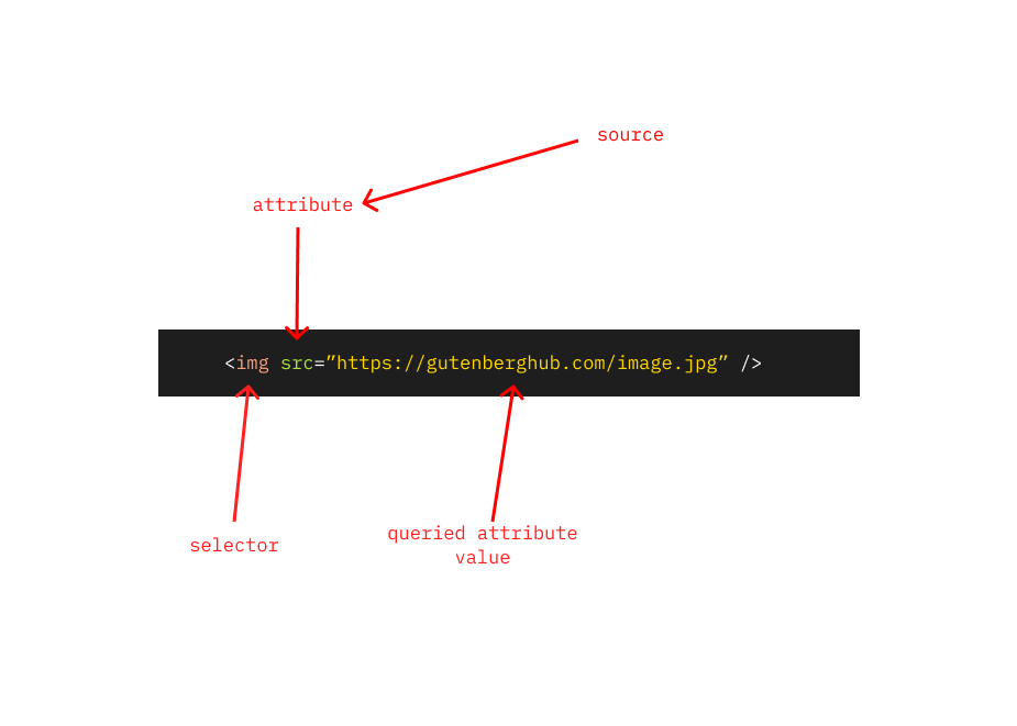
Let’s register our first block attribute, we need a block attribute that stores the fetched image source (URL). We’re naming the attribute “src” (because it will contain the image source).
{
    "attributes": {
        "src": {
	        "type": "string",
	        "selector": "img",
	        "attribute": "src",
	        "source": "attribute"
	    }
    }
}
I’ll explain the attribute definition above along with their usage.
| Property | Usage |
| type | We’re defining here that our attribute is going to store a string datatype. |
| selector | The selector is the HTML tag source, that will be used to query the element from the block static markup. |
| attribute | The attribute is the HTML attribute that will be on the element queried by the selector. Don’t confuse this with block attributes. |
| source | We’re defining that the source of this particular block attribute is the HTML attribute. |
I know, the explanation above can be confusing for beginners. Here is a visual explanation of the above attribute definition.
Using the Unsplash API
We’re gonna be using the Unsplash API for fetching random images. The following endpoint redirects us to a random Unsplash image when requested.
https://source.unsplash.com/random
In order to make everything organized, let’s create a new directory “api” in our block source, Inside that directory, create a new file named “image.js”.
Now, we need to create an API handler method, that calls the Unsplash API and obtains the redirected URL.
// src/api/image.js
export async function getRandomImage() {
	try {
		const apiEndpoint = "https://source.unsplash.com/random";
		const url = await (await fetch(apiEndpoint)).url;
		return url;
	} catch (error) {
		console.error(error);
		throw error;
	}
}
How it works
Now that we’ve created the API handler we need some way to use that based on some user interaction.
This is how the it should work:

User clicks on “Create a random image“
↓
Send API Request to Unsplash API
↓
Store the fetched image source in attribute
↓
Render the obtained image in the Gutenberg editor.
1. User clicks on button
Let’s attach a click listener called “updateImage” to our button. Currently, this listener is not defined. We’ll create this below.
// edit.js
<Button variant="primary" onClick={updateImage}>
    {__("Create a random image", "random-image")}
</Button>
2. Send API Request
Now, let’s create the click listener. It’s going to be an asynchronous method as it will handle API calls.
// edit.js
const updateImage = async () => {
    const image = await getRandomImage(); // Our API handler.
};
3. Storing the fetched image in our block attribute
Let’s update the click listener to also store the fetched image source in the block attribute.
// edit.js
const updateImage = async () => {
    const image = await getRandomImage(); // Our API handler.
    props.setAttributes({ src: image }); // Updating the attribute.
};
4. Renders the fetched image in gutenberg editor
Currently, not much will happen even If you’ve followed the above steps. Because the block UI does not currently use the attribute anywhere.
Now, we need to somehow conditionally disable the initial placeholder based on our “src” attribute.
This is how our block should behave in different scenarios.
| Condition | What should happen? |
| Image source is available | We need to render the image based on the source. |
| Image source is not available | We need to render an initial placeholder. |
Let’s create a constant, that stores a condition that will be evaluated to a boolean value, containing “true” if the source is available, otherwise will contain “false“.
const isSourceAvailable = typeof props.attributes.src !== "undefined";Now, by using this constant we can conditionally render image and placeholder:
<div {...blockProps}>
    {isSourceAvailable && <img src={props.attributes.src} />}
    {!isSourceAvailable && (
        <Placeholder
            icon={<BlockIcon icon="format-image" />}
            label={__("Random image block", "random-image")}
            instructions={__("Quickly add random placeholder images in your site.","random-image")}
        >
            <Button variant="primary" onClick={updateImage}>
                {__("Create a random image", "random-image")}
            </Button>
        </Placeholder>
    )}
</div>
This is how our block should look in this current stage.
Add an option in gutenberg block toolbar for updating the image
Currently, the user is bound to update the image from the initial placeholder. The placeholder should only be visible initially, Therefore we need some additional way for users to be able to update the image, even after the initial placeholder.
Block toolbars are a great way to quickly add shortcuts to your Gutenberg block.
Let’s import some toolbar UI components, along with a slot fill that will be used to render these UI components in the block toolbar.
If you don’t know about slot fills, You can read more here.
// edit.js
import {
	ToolbarGroup,
	ToolbarButton
} from "@wordpress/components";
// edit.js
import {
BlockControls, // Slotfill
} from "@wordpress/block-editor";After importing the components, let’s add a simple toolbar button.
// edit.js
<BlockControls>
    <ToolbarGroup>
        <ToolbarButton
	    showTooltip
	    icon="update-alt"
	    label={__("Try another image", "random-image")}
	/>
    </ToolbarGroup>
</BlockControls>
This should give us a simple toolbar button, which currently does not do anything.
Let’s add some functionality to this button, We can attach the same click listener (as we did above) to this toolbar button, and we should also conditionally render this button when the image source is available.
// edit.js
<BlockControls>
<ToolbarGroup>
{isSourceAvailable && (
<ToolbarButton
showTooltip
icon="update-alt"
onClick={updateImage}
label={__("Try another image", "random-image")}
/>
)}
</ToolbarGroup>
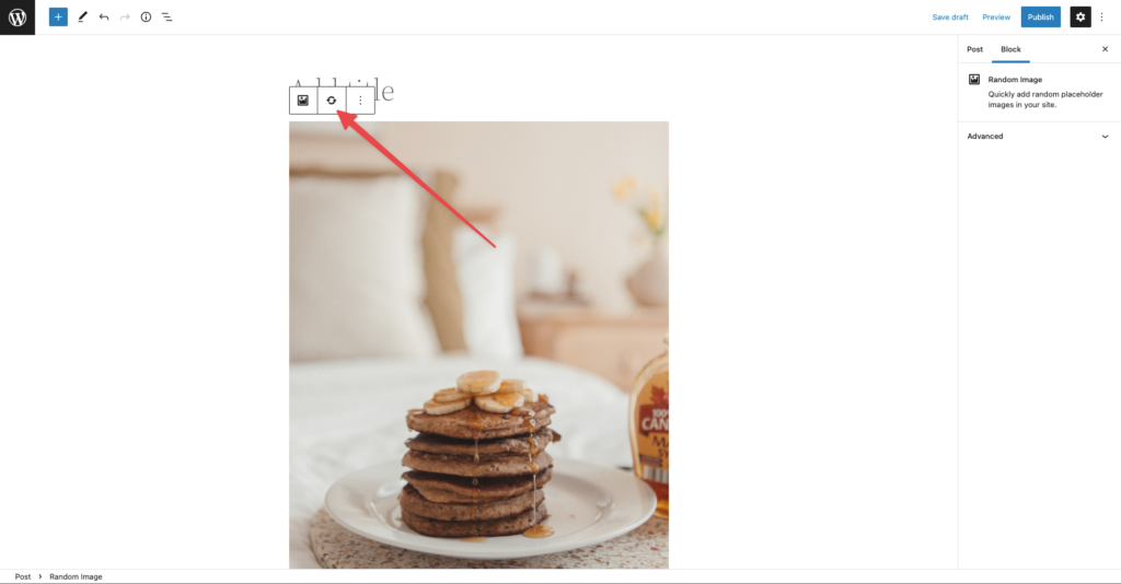
</BlockControls>Here’s how the block should be at the current stage
Improving the user experience
User experience is something that should be a top priority when programming your WordPress plugin/ WordPress Theme etc, the same goes for Gutenberg blocks. We need to ensure that our users can easily understand and use our block plugin.
We took care for user experience by adding block placeholder, Here are a few improvements that can enhance the user experience further.
Indicate loading state
We need some way to indicate to the user that our block is currently processing something. Loading states enhances the user experience. Currently, there are 2 loading states in our Gutenberg block
- When the user requests a random image from initial placeholder.
- When the user resets the image from block toolbar.
You can read more about react states here
We need a global state that stores the loading status of our block. Here’s how we can create a simple state in our block
React hooks should only be used at the top of a react component.
import { useState } from "@wordpress/element";const [loading, setLoading] = useState(false); // Using the hook.Now that we’ve created a global state, let’s update this state to reflect our block loading status. In order to achieve that, we need to update our image update handler method.
const updateImage = async () => {
    setLoading(true);
    const image = await getRandomImage();
    props.setAttributes({ src: image });
    setLoading(false);
};
Now, our “updateImage” handler also maintains the loading state. We can now use this state to indicate the loading status to the user.
Adding loading indication to our initial placeholder

We can achieve the result above, by simply making our button busy based on the loading state.
<Button variant="primary" isBusy={loading} onClick={updateImage}>
    {__("Create a random image", "random-image")}
</Button>
Adding loading indication when the user requests another image
Now, let’s also indicate to the user that an image is requested for reset. In order to achieve this, It would be better to create a separate provider component that will provide/handle loading UI for it’s children. You can structure as you want, I would like to structure it as follows.
“block src → components → disabled-loading → index.js”
// src/components/disabled-loading/index.js
import PropTypes from "prop-types";
import classnames from "classnames";
import { Spinner } from "@wordpress/components";

function DisabledLoading({ children, isLoading }) {
	const wrapperClass = classnames("disabled-loading", {
		loading: isLoading,
	});

	return (
		<div className={wrapperClass}>
			{children}
			{isLoading && (
				<div className="loading-spinner">
					<Spinner />
				</div>
			)}
		</div>
	);
}

DisabledLoading.propTypes = {
	/** Is currently loading? */
	isLoading: PropTypes.bool.isRequired,
};

export default DisabledLoading;
Now, let’s add some styles for our component.
/** src/components/disabled-loading/style.scss **/
.disabled-loading {
	&.loading {
		&::before {
			content: "";
			width: 100%;
			height: 100%;
			background-color: rgba(0, 0, 0, 0.5);
			position: absolute;
			top: 0;
			left: 0;
			z-index: 1;
			pointer-events: none;
		}
	}

	.loading-spinner {
		position: absolute;
		left: 50%;
		top: 50%;
		transform: translate(-50%, -50%);
		margin: 0;
		z-index: 2;
	}
}
We need to also include this “style.scss” partial file in our editor.scss
/** src/editor.scss **/
@import "./components/disabled-loading/style.scss";
Lets now use this component in our image to indicate a loading
{isSourceAvailable && (
    <DisabledLoading isLoading={loading}>
        <img src={props.attributes.src} />
    </DisabledLoading>
)}
Error handling
Error handling is something, that should be of top priority. Error handling means that we need to deal with some possible issues that can happen in our block.
For instance, considering our Gutenberg block, we need to handle what should happen when we fail to obtain the image from Unsplash API?. Now, the source of the API request failure could be anything, like
- No Internet connection.
- Issues with Unsplash API.
Adding error handling to our gutenberg block
Let’s update our “updateImage” to also handle error states.
But first, let’s understand how can we create Gutenberg notices within our Gutenberg block.
Gutenberg is a react application based on redux-like stores, We can dispatch some built-in actions. We can use “useDispatch” hook to obtain and dispatch actions.
// src/edit.js
import { useDispatch } from "@wordpress/data";
Let’s de-structure a core Gutenberg action, that can be used to create notices.
// src/edit.js
const { createErrorNotice } = useDispatch("core/notices");
Now we can update our handler to also throw notices when required.
const updateImage = async () => {
		setLoading(true);
		try {
			const image = await getRandomImage();
			props.setAttributes({ src: image });
		} catch (error) {
			createErrorNotice(
				__("Something went wrong, Please try again later!", "random-image"),
				{
					type: "snackbar",
				}
			);
		} finally {
			setLoading(false);
		}
};
Working for Frontend
We’ve now completely covered everything we need to do in our editor. Currently, the block does nothing when previewed on the front end.
The frontend part is quite straightforward for this Gutenberg block. We just need to render the image based on the attribute source.
// src/save.js
import { __ } from "@wordpress/i18n";
import { useBlockProps } from "@wordpress/block-editor";
export default function save(props) {
const { attributes } = props;
return (
<div className="gutenberghub-random-image-block">
<img {...useBlockProps.save()} src={attributes.src} />
</div>
);
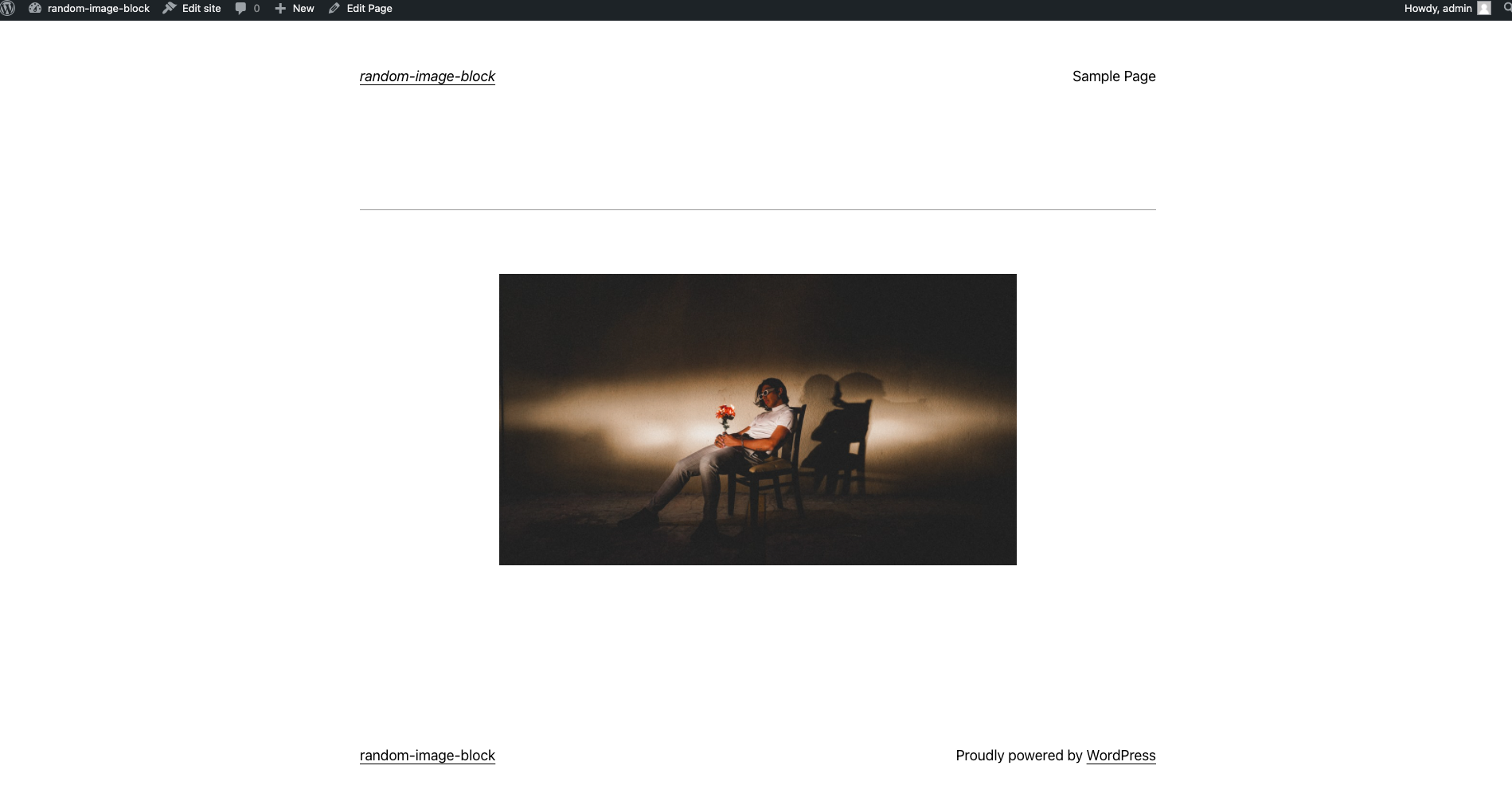
}This is how the final result should be on the front end.


Leave a Reply