In this tutorial, we will create an interactive yet simple FAQ page design in Gutenberg. This will be a two-column layout with the question placed in the left column. The FAQ question remains sticky until the relevant answer’s content scrolls.
Here is a sneak peek of how it looks.
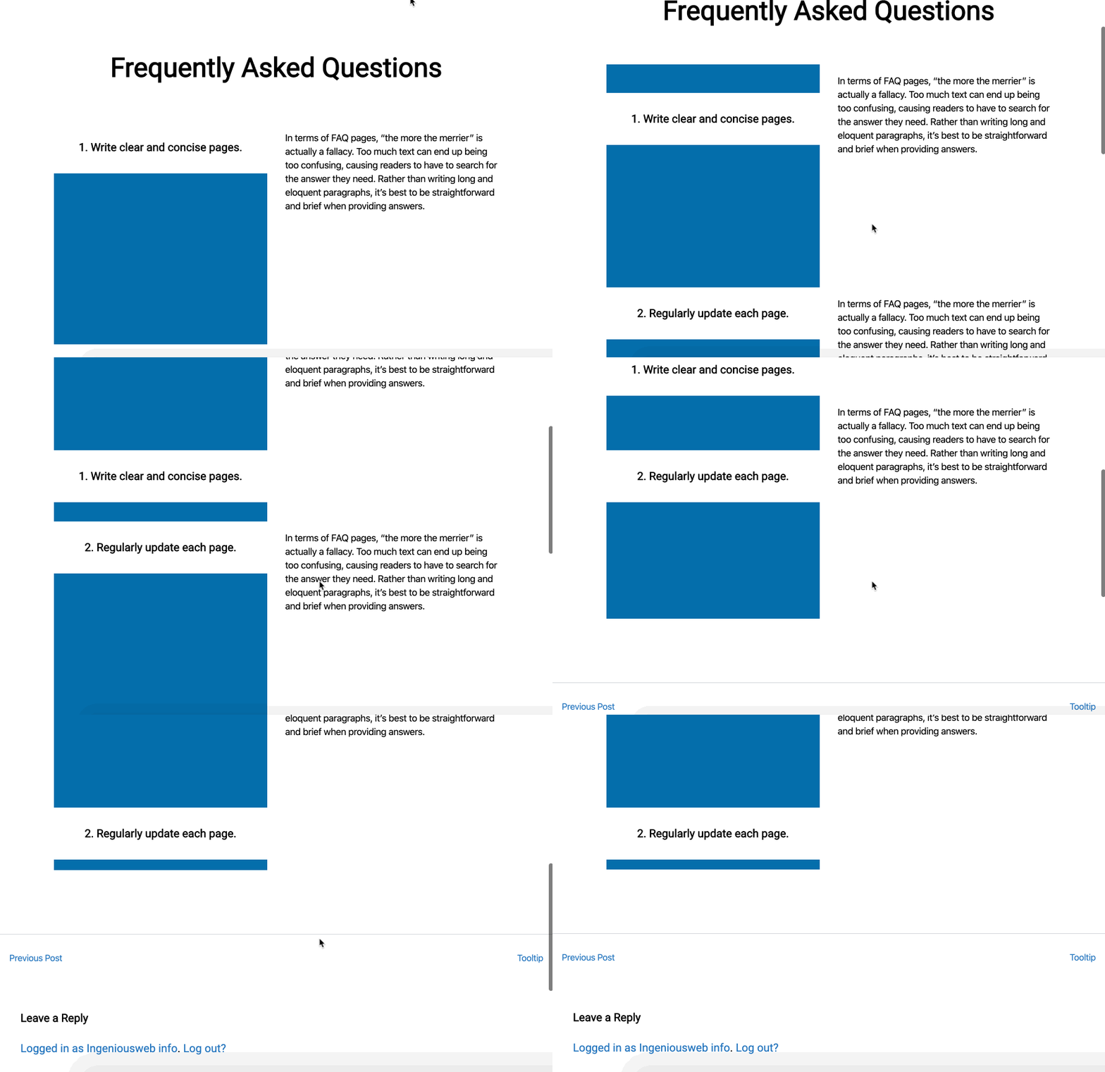
Notice that the question in the left remains there till the next question gets focused. Also to be noted that we are not using any extra plugin or Javascript to create this effect.
Let’s Start!
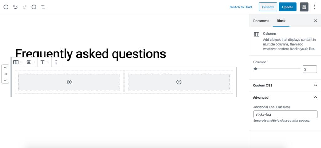
Let’s add the headline Frequently Asked Question. Then we add columns block with two columns. Assign a CSS class sticky-faq to this columns block.
Now, write the question using the headline block in the first column and the answer using the text block in the second column.
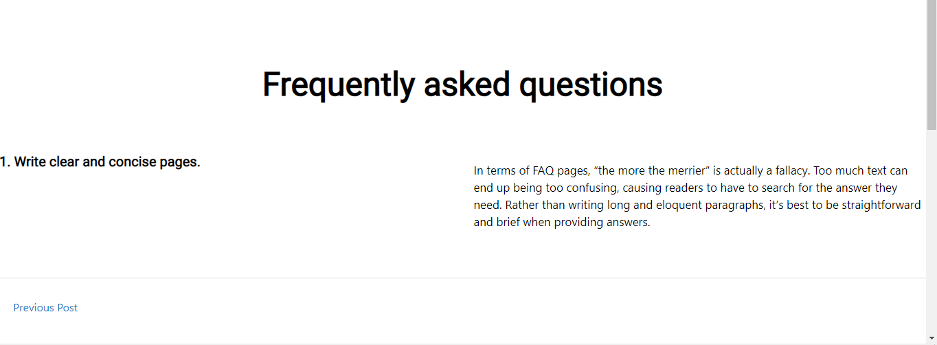
We need to remove the top and bottom margin for this columns block so that the other columns block we will add later for each FAQ has no spacing between them.
.sticky-faq {
   margin:0 auto;
}
Now we need to apply some styling to our first column which contains the question. We are simply adding a background color and a height of 400px. Then we are changing the background color on hover with transition property to make a nice hover effect.
.sticky-faq .wp-block-column:first-child{
   background-color:#046eab;
   height:400px;
}
.sticky-faq .wp-block-column:first-child:hover{
   transition: 0.6s;
   background-color:#0693e3;
}
We also need to make our Questions stand out. So let’s add a background color to that with some padding and set the maring to zero so it stretches to the width of the column.
.sticky-faq h3{
   background-color:#fff;
   padding:30px;
   margin: 0;
}
Note: We are targeting H3 in the following code, as we set our question headline block to H3. If you opt to use H2 or any other heading level, make sure to adjust the following code as well.
This is how it looks now. Our first FAQ is ready.
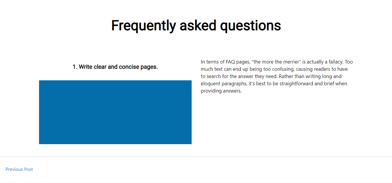
Now duplicate this columns block to create more FAQs and if you like you may adjust the column’s background color a little bit to make a nice visual effect.
And obviously change your question and answer content in each FAQ columns you duplicate.
Now we just need to apply some final magic CSS on our FAQ’s questions (h3 in our case).
.sticky-faq h3{
   position: sticky;
   position: -webkit-sticky;
   top: 200px !important;
}
That is it. You may duplicate one FAQ to create more items on the page and just update the Question & Answer content.
Here is the complete CSS code for you.
.sticky-faq{
    max-width:80%;
    margin:0 auto;
}
.sticky-faq .wp-block-column:first-child{
   background-color:#046eab;
   height:400px;
}
.sticky-faq .wp-block-column:first-child:hover{
   transition: 0.6s;
   background-color:#0693e3;
}

.sticky-faq h3{
   background-color:#fff;
   padding:30px;
   margin: 0;
  position: sticky;
   position: -webkit-sticky;
   top: 200px !important;
}
Hope you enjoy the tutorial. It was inspired by Elegant Themes Tutorial for Divi here.



Leave a Reply