How about creating a scroll effect to your multi-column content? It’s pretty easy and adds a nice visual attraction to your web page.
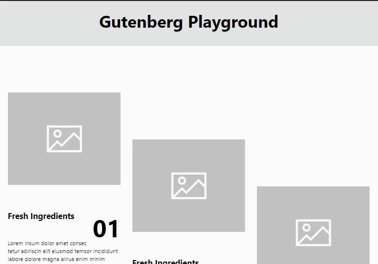
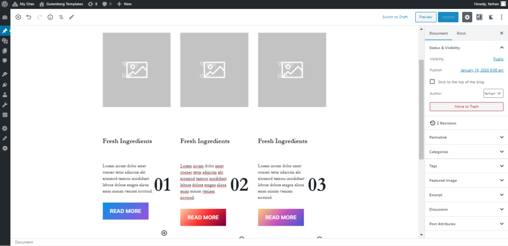
So here is the sneak peek of what we are going to create in this quick tutorial.
So let’s learn how you can create this nice effect in Gutenberg.
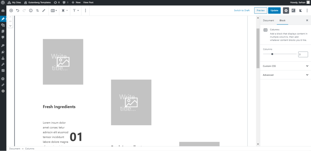
This is to work with multi-columns, so you may create any number of columns content as you like. And can have anything as your content in the columns.
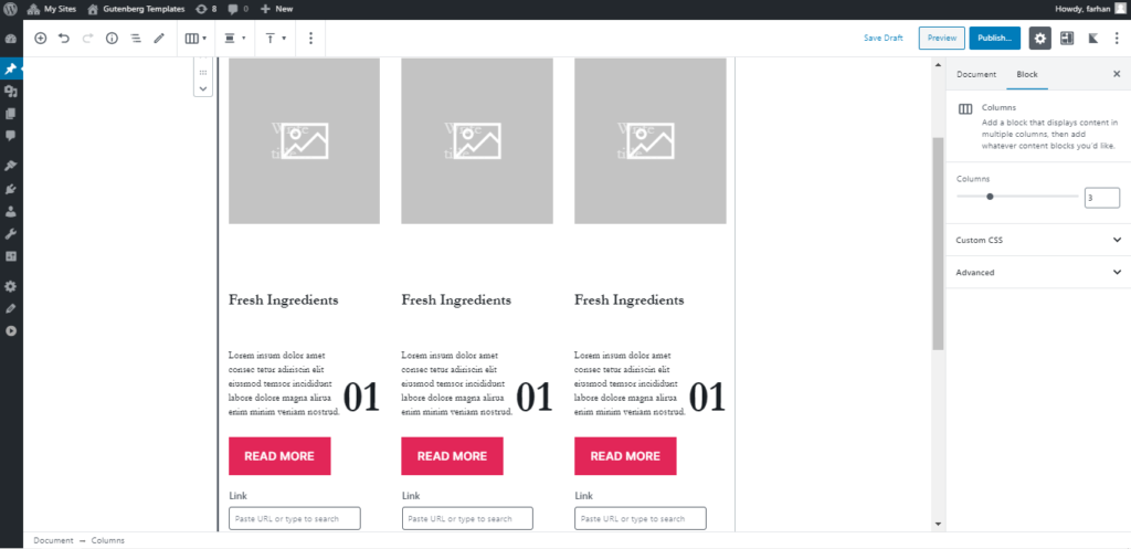
I will just create something simple for this demo.
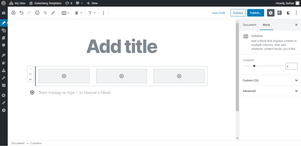
Add a group block inside the column and add your content inside the group block using any Gutenberg Blocks you like.
Now simply add content in other columns as well.
Now we have our content ready its time to apply some magic CSS to create a nice Interactive Scroll Effect.
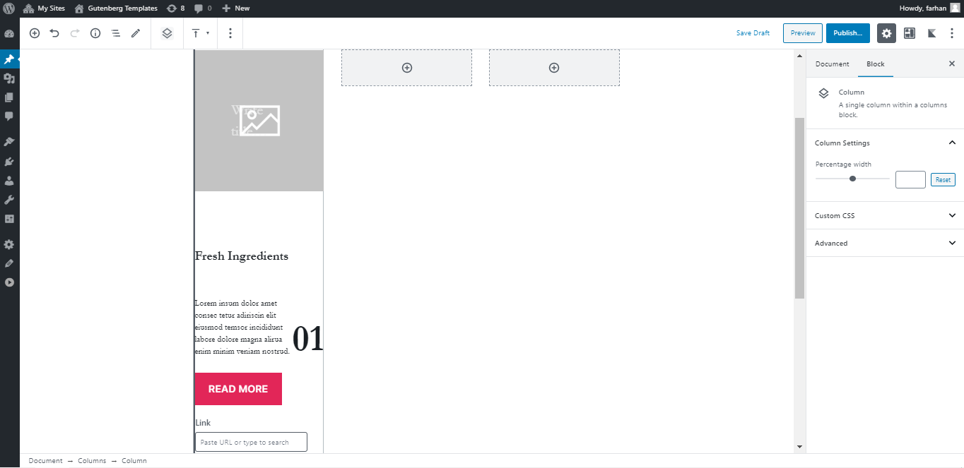
Add a CSS class sticky-content to your main columns block. This is because we need to target this specific column block so that our CSS doesn’t interfere with other Columns you may have on the page.
Now, we need to add top padding to columns one, two and three. You need to increase the padding for each column.
- Column one padding-top: 7vw;
- Column tow padding-top: 20vw;
- Column three padding-top: 32vw;
.sticky-content .wp-block-column:nth-child(1) {
padding-top:8vw !important;
}

.sticky-content .wp-block-column:nth-child(2) {
padding-top:20vw !important;
}

.sticky-content .wp-block-column:nth-child(3) {
padding-top:32vw !important;
}
Now let’s add the following CSS to complete our Interactive Scroll Effect.
.sticky-content .wp-block-group {
position: sticky;
position: -webkit-sticky;
top: 8vw !important;
}
That is it. Now you should have nice interactive content but we need to limit this effect to desktop screen size as on mobile screen your columns are stacked so this effect should not work there. For that, we will simply limit our CSS to apply on Desktop screen sizes using CSS media queries.
Here is our final and complete CSS code.
@media only screen and (min-width: 980px) {
.sticky-content .wp-block-group {
position: sticky;
position: -webkit-sticky;
top: 8vw !important;
}
.sticky-content .wp-block-column:nth-child(1) {
padding-top:8vw !important;
}

.sticky-content .wp-block-column:nth-child(2) {
padding-top:20vw !important;
}

.sticky-content .wp-block-column:nth-child(3) {
padding-top:32vw !important;
}
}
Pretty simple and short CSS code. Here is the final result again.
Hope this is useful to you. Do share what you create using this in the comments section. ?


Leave a Reply