Stackable plugin by @gambitph adds the missing design blocks and options you need in the WordPress Gutenberg editor. Like any other plugin, this one is also in the active development stage. There are about 15 really cool blocks already available to use and they plan to add more in the future.
Let’s have a at all the available blocks. I will also try to pass my quick feedback & suggestion for the plugin author to improve the plugin.
A quick look at the available Blocks
At the time of writing this post there are currently following new blocks this plugin brings to the Gutenberg editor.
- Image box
- Count up
- Video Popup
- Testimonials
- Team Members
- Call to Action
- Notification
- Blockquote (Improved!)
- Pullquote
- Number box
- Button (Improved!)
- Ghost Button
- Expand / Show more
- Divider (Improved!)
- Spacer
Image box Block
Image box block in Stackable is kind of similar to the “Cover Image” block comes default with Gutenberg editor. However, it got but different features and controls.
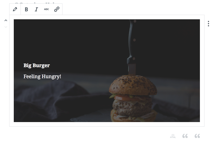
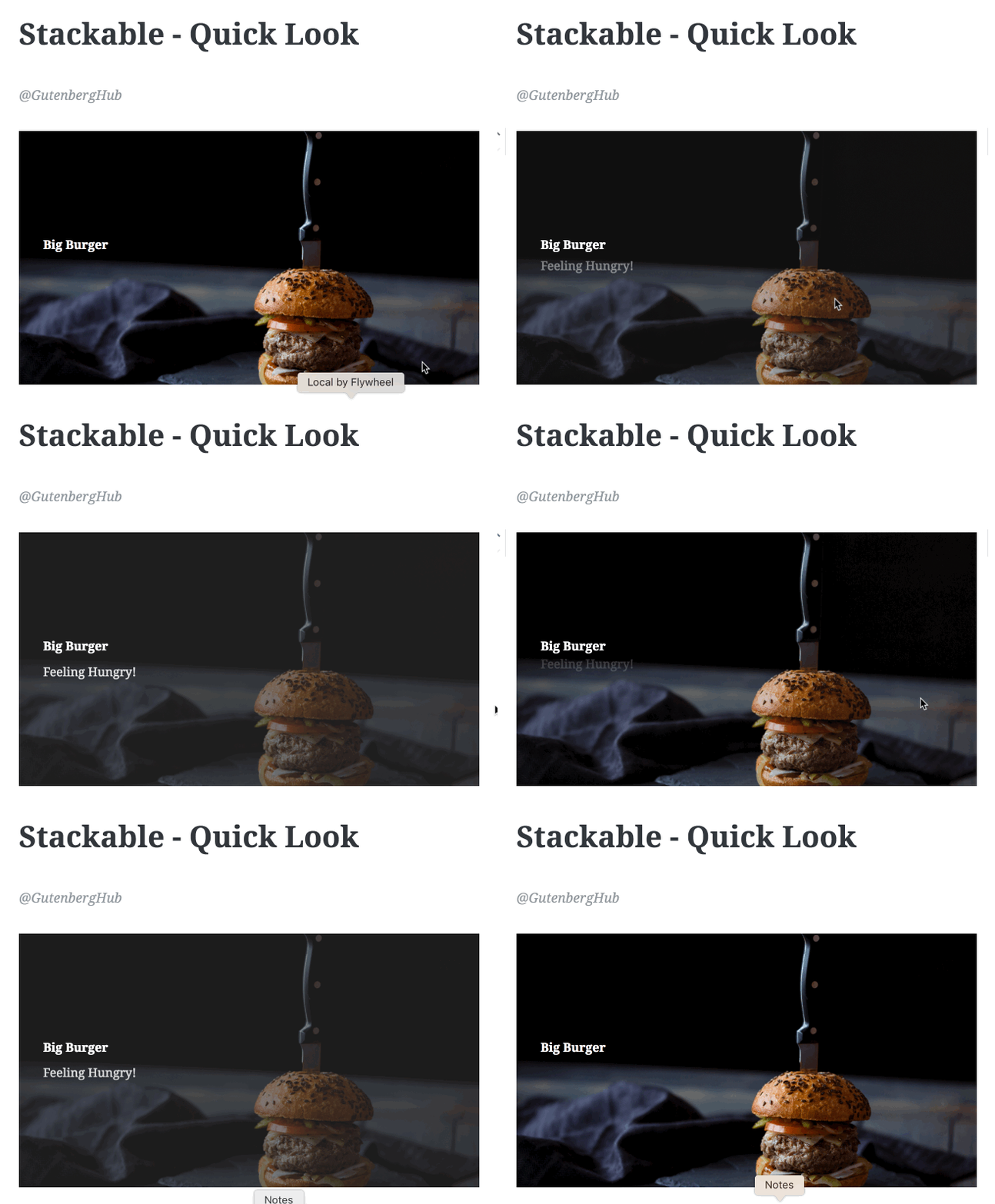
This block contains a background image with a title and a subtitle on top of it. It comes with pretty decent controls to customize the block. Currently, it has the following options/controls.
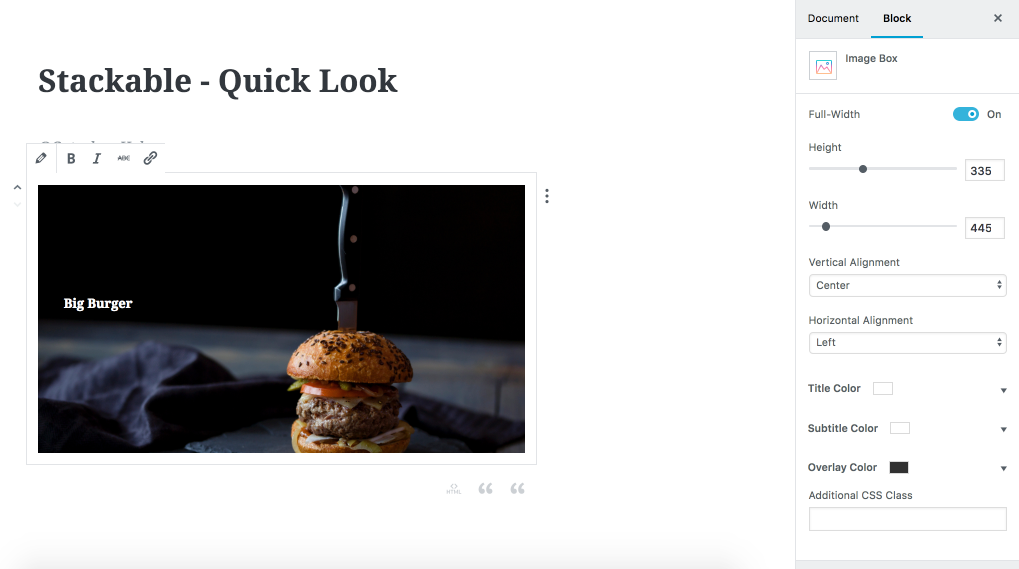
- Full-width toggle – Enable to make it full width.
- Height slider – You can adjust the block height.
- Width slider – You can adjust block width.
- Verticle Alignment – You can adjust the content alignment within the block.
- Horizontal Alignment – Adjust the horizontal alignment of content.
- Color controls for Title, Sub Title and Overlay
- You also got basic text styling controls on the block toolbar to make your title/subtitle Bold, Italic, etc.
Quick Feedback & Suggestions to improve this block
- Title & Sub Title Font Size controls.
- Ability to align block (main block div).
- Ability to position background image to adjust it better.
- How about full height toggle as well, to make it full-screen height.
Count up Block
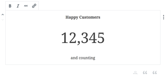
The count up block in the Stackable plugin is a great addition. If you wish to display some stats to your post or page this block may come handy.
It allows you to set a Headline, Count up number & Description. On the front-end, these numbers start rotating on page load, from 0 to whatever you set there. There are controls to customize the color of headline, numbers & descriptions. Also, you can adjust the font-size of the numbers. And from the block controls, you get basic font-styling controls.
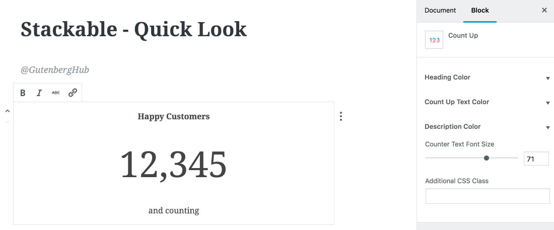
Quick Feedback & Suggestions to improve this block
- Title & Description font size controls.
- Ability to disable Title & Descriptions.
- How about the Background color?
Video Popup Block
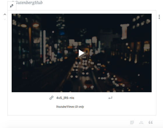
As the name suggests, this block allows you to add any video from Youtube or Vimeo to open & play in a popup. Here is the front-end demo.
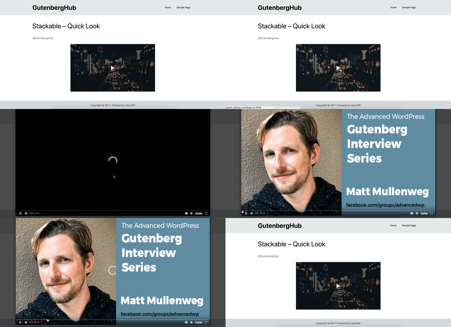
A little useful block with options to choose different styles of play icons and change the overlay color.
Quick Feedback & Suggestions to improve this block
- Ability to adjust video size.
- Ability to use self-hosted video.
- More customization options.
Testimonials Block
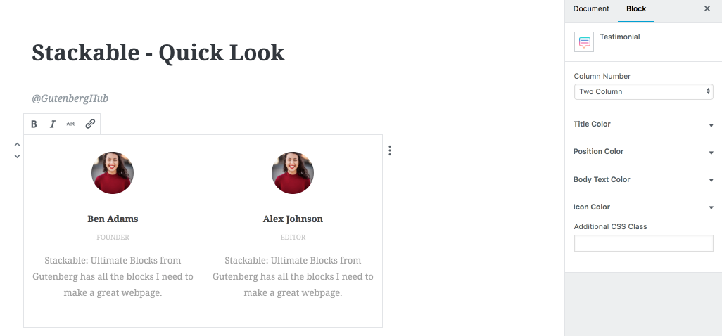
Need to showcase some testimonials on your website, here is the block you can use. It allows you to display testimonials in 1,2 or 3 columns (right now).
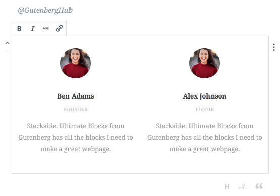
There are options to customize colors and adjust the number of columns.
Quick Feedback & Suggestions to improve this block
- Adjust font-sizes.
- Maybe 1 more column would be useful. Up to 4 columns are good to go.
- More image shapes.
- How about the ability to convert it to a testimonial carousel as well?
Team Members
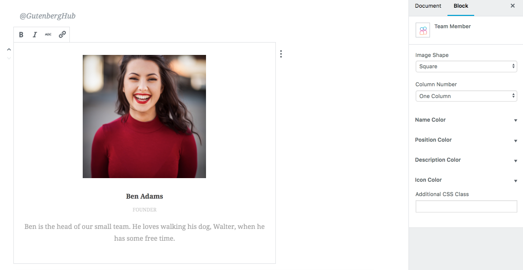
This one is almost exactly same as the testimonial block they have for now, with the exception of the ability to change image shape.
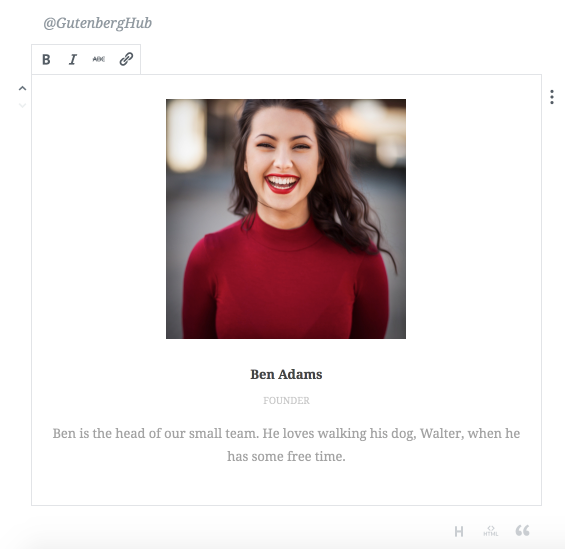
This got almost same options as the testimonial block. With one additional option to change the shape of the image.
Quick Feedback & Suggestions to improve this block
- Adjust font-sizes.
- Maybe 1 more column would be useful. Up to 4 columns are good to go.
- Social icons missing, icon color control is there though?
- How about the ability to convert it to a testimonial carousel as well?
Call to Action Block
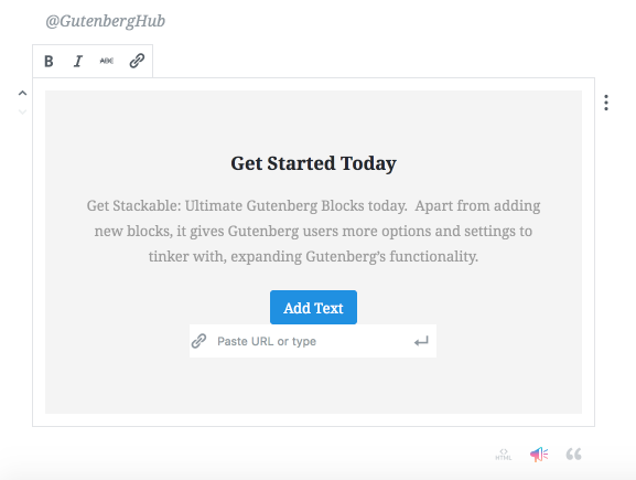
Another useful block you will find in the Stackable plugin is the “Call to Action” block. It allows you to put an eye-catching call to action content on any page or post. This block has a bunch of customization options available to style the content.
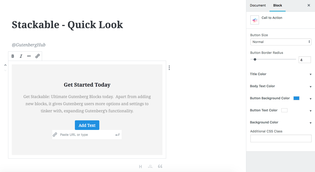
Quick Feedback & Suggestions to improve this block
- More layout options, like compact layout where the button goes to the right side.
- Font-size controls.
- How about background image or gradient?
Notification Block
Want to display some notification on your website, this block will come handy.
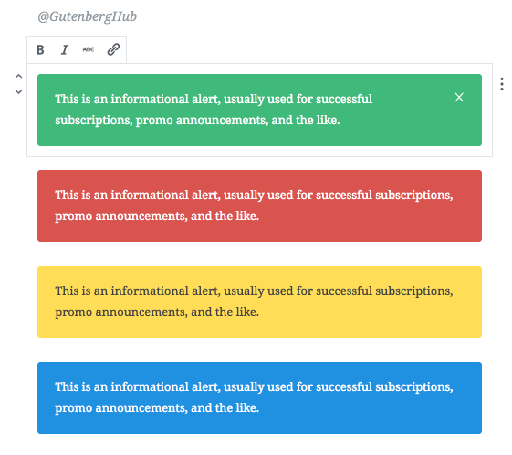
it comes with four standard notification presets, but you can choose any color for the background and text. You can also make the notification dismissable.
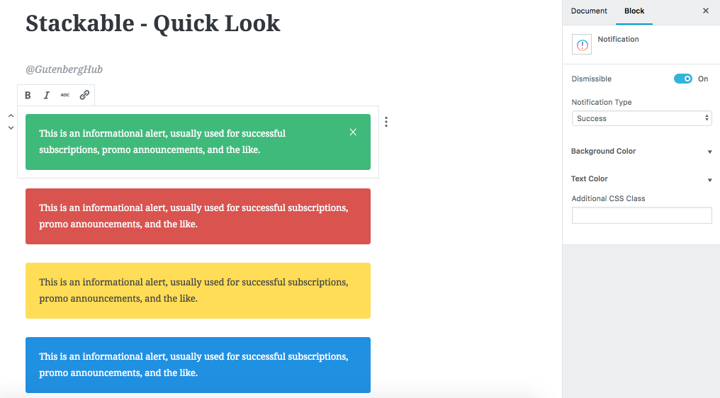
Quick Feedback & Suggestions to improve this block
A pretty fine block may be the ability to adjust the width would be useful.
Blockquote Block
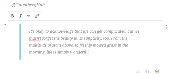
This also includes a block quote block. However Gutenberg itself has a quote block, but this one comes with some styling options, currently only able to adjust the text & border color.
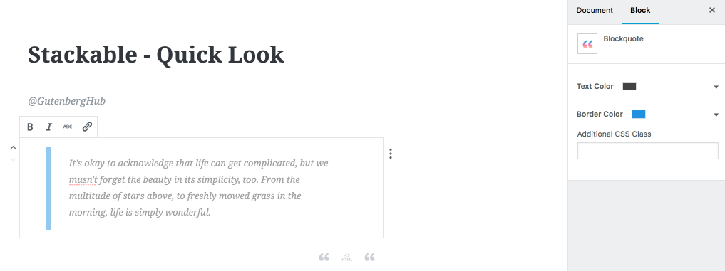
Quick Feedback & Suggestions to improve this block
- More styles, default quote block already offer 2 styles.
- More customization controls.
Pullquote Block
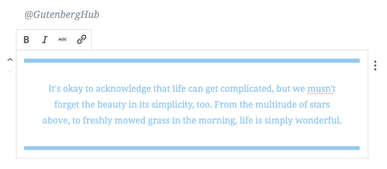
This is an alternative to the default pull quote blocks comes with Gutenberg itself. This also adds additional styling controls to customize the color of text and border.
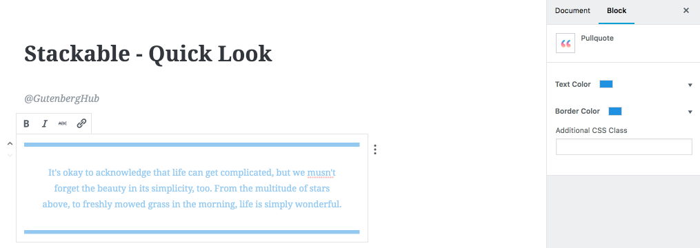
Quick Feedback & Suggestions to improve this block
- More styles.
- More customization controls.
Number Box Block
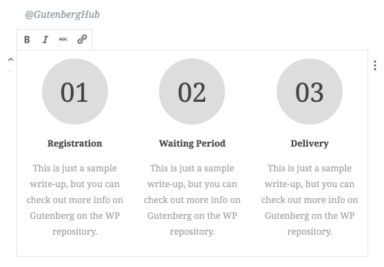
The Number box block may be handy if you need to highlight some steps or procedure. It currently allows up to 3 columns in a single block, but you may take another copy of it to add more steps. There are options to customize the colors of content and number’s background.
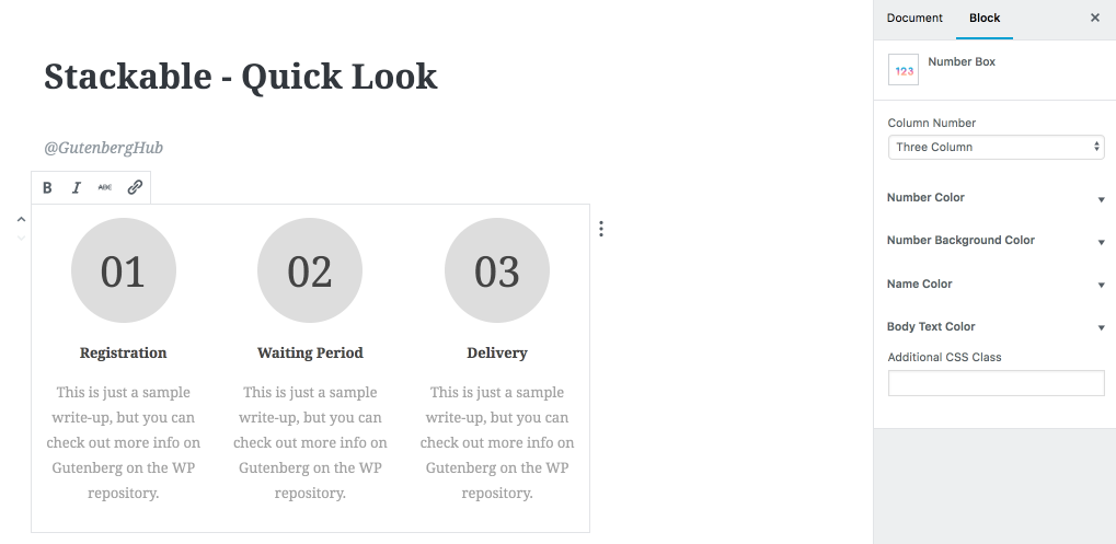
Quick Feedback & Suggestions to improve this block
- More shapes for the number div.
- Font-size controls.
- More styles, like may be linked lines between each number/column so that it looks more like steps.
Button Block
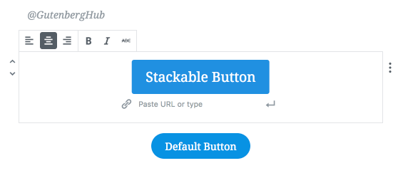
This is an improved alternative for the default Gutenberg button block. This button block in stackable comes with extra customization controls. You can set the buttons size to small, normal, medium and large. You can also adjust the button corner radius, text and background color.
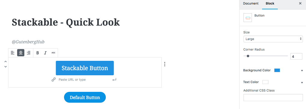
Quick Feedback & Suggestions to improve this block
- Possibility to make button Full width.
- Ability to add an icon to the left or right of the text.
- Button Hover state customization (background & text color).
- More styles would be great.
Ghost Button
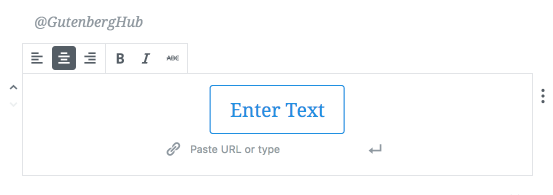
Similar to the button block, this simply is another style of the button which doesn’t have any background color. This comes with options to adjust the button radius, button border width, button color and different size options.
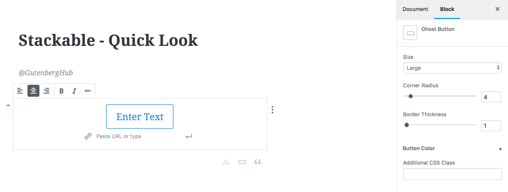
Quick Feedback & Suggestions to improve this block
It would be better to merge these customizations simply in the button block.
Expand / Show more Block
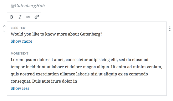
A simple text expander block. May come handy in certain cases where you need to hide some long text. Here is how it works on the front-end.
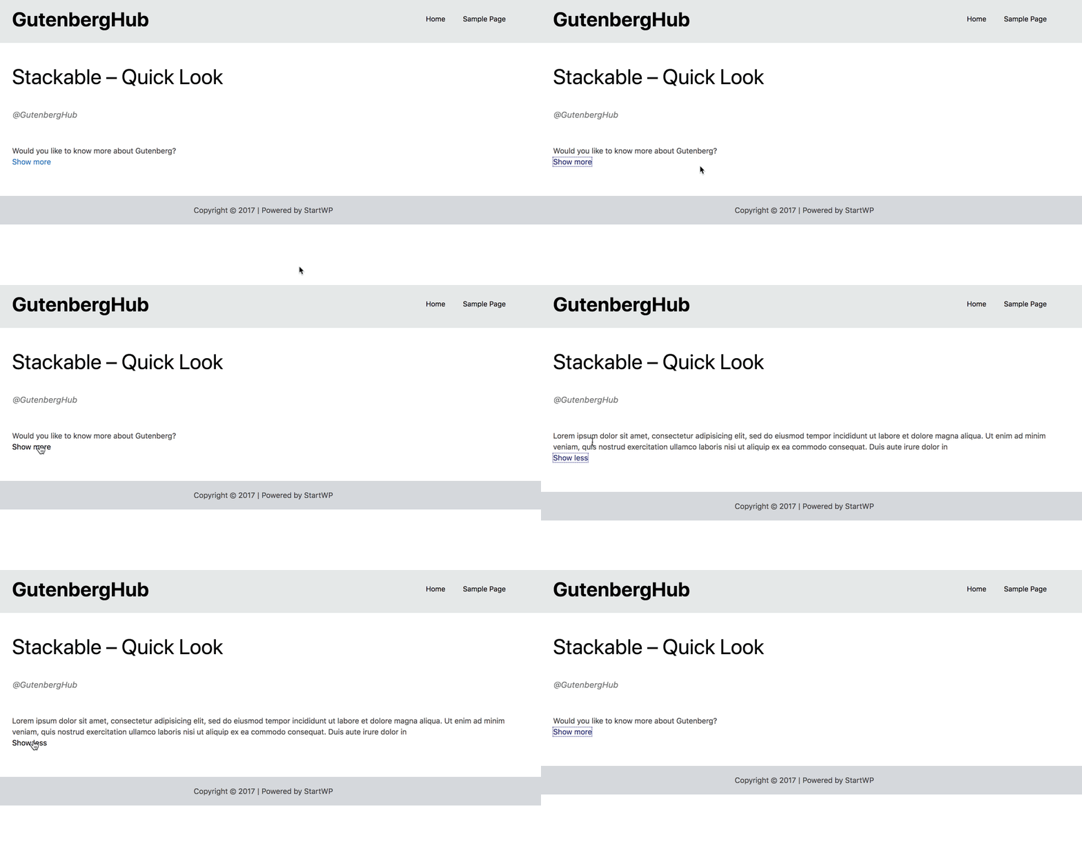
It comes with simple text formatting block controls for now.
Quick Feedback & Suggestions to improve this block
- More customization controls.
- Option to not hide the less text, to make it work like a toggle.
Divider Block
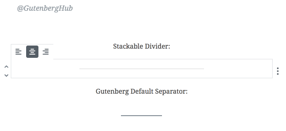
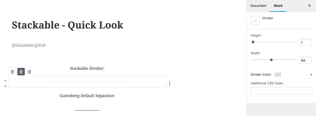
Divider block in the Stackable plugin is an alternative to the default Separator block in Gutenberg editor. The divider block comes with extra options to adjust the width, height, and color of the divider line.
Quick Feedback & Suggestions to improve this block
- More divider styles
- How about verticle dividers?
Spacer Block
Last on the list, we get a simple spacer block. Simply add it wherever you need some extra spacing. You can adjust the height.






Leave a Reply