Would you like to add an attractive collapsible tabs menu to your WordPress site? You can achieve this with the Kadence Blocks plugin. This guide will walk you through creating a cool collapsible tabs menu using the default Kadence Tab Block and a bit of custom CSS. By following these steps, you’ll transform your tabs into a dynamic accordion-style layout that’s both functional and good-looking.
Setting Up Your Tabs Block
Begin by adding a new section to your page. Make sure it’s full-width so it can hold your tabs menu and content.
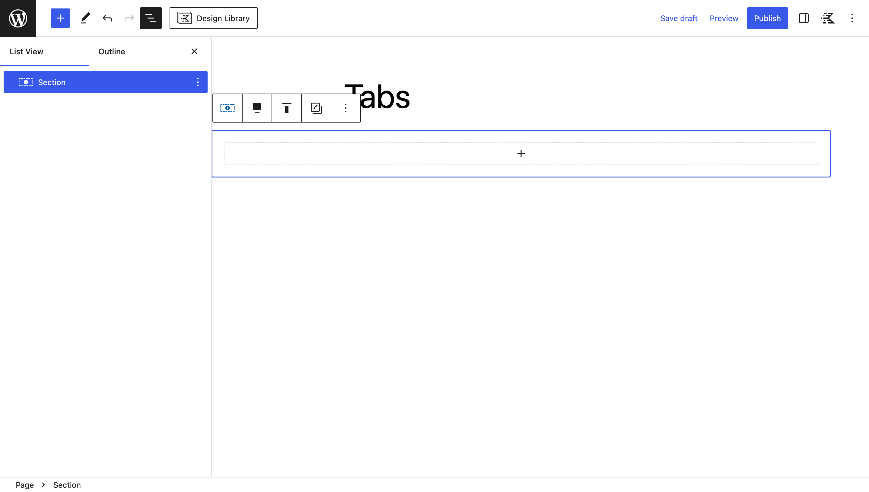
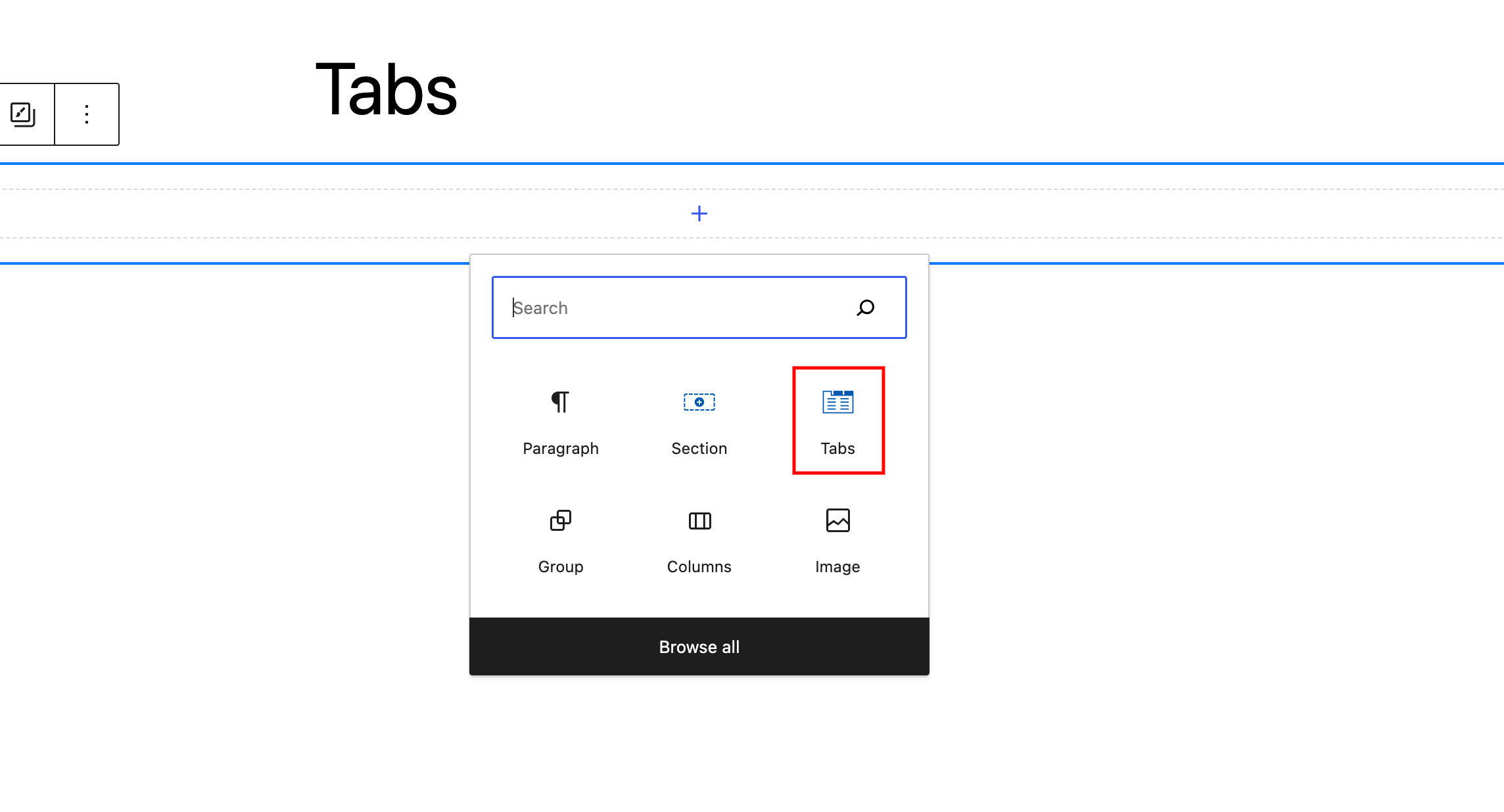
Inside the section, insert a Kadence Tabs Block. This block comes with different tab styles that you can make your own.
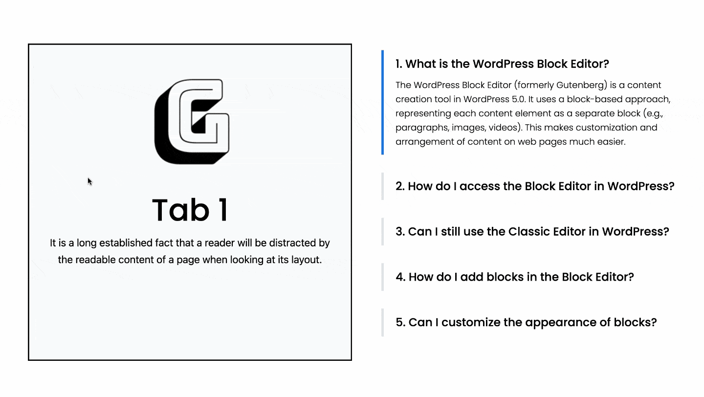
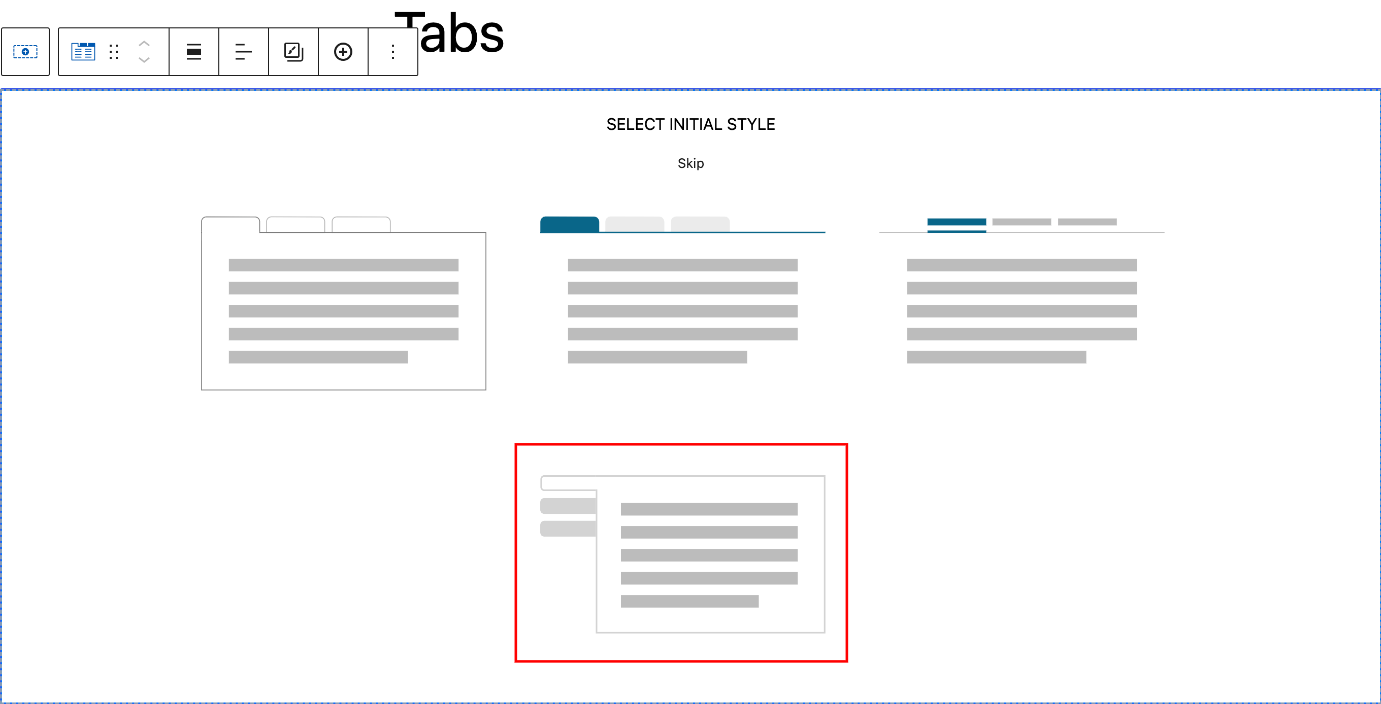
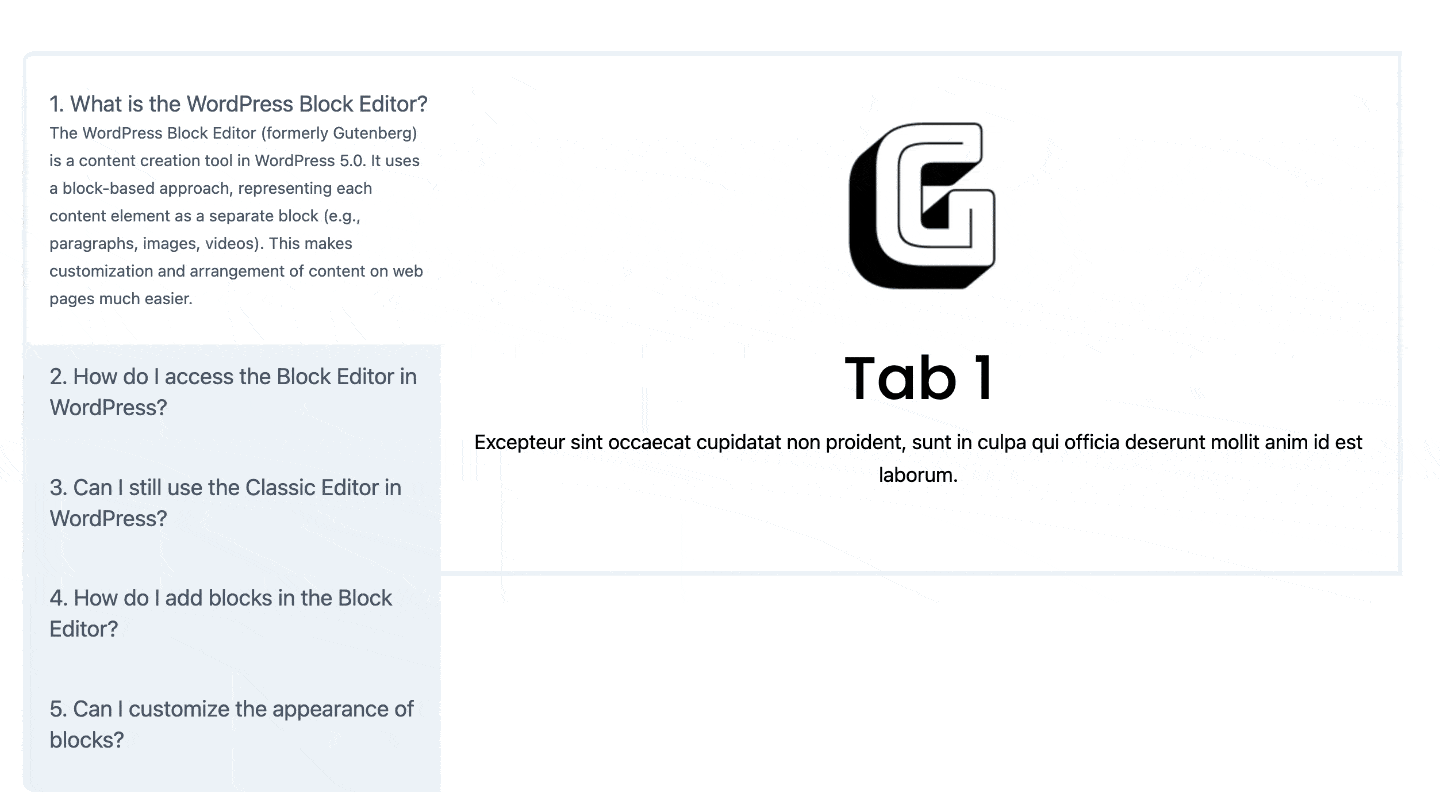
Pick the vertical tab style. This makes your tabs line up vertically.
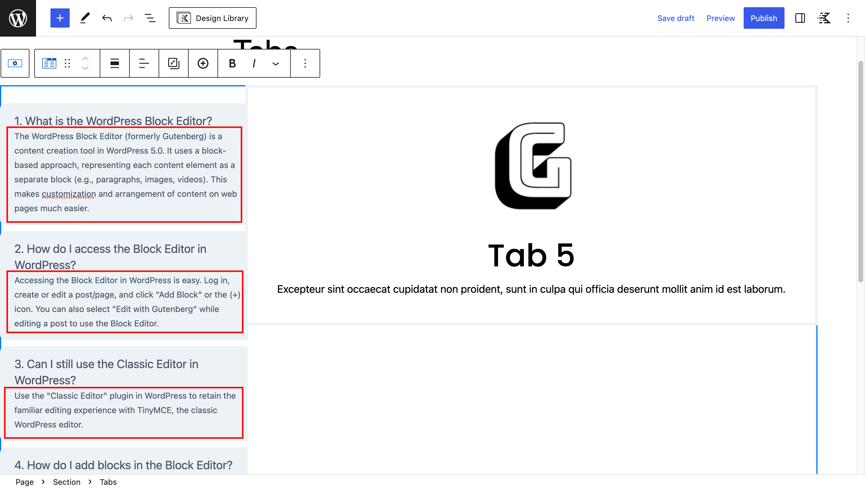
Put your content into each tab. You can include text, pictures, or other things you want people to see when they click the tabs.
To make your tabs menu collapsible, go to the “Style” tab in the Tabs Block settings. Turn on the “Show Subtitle” option. This lets you add a subtitle to each tab.
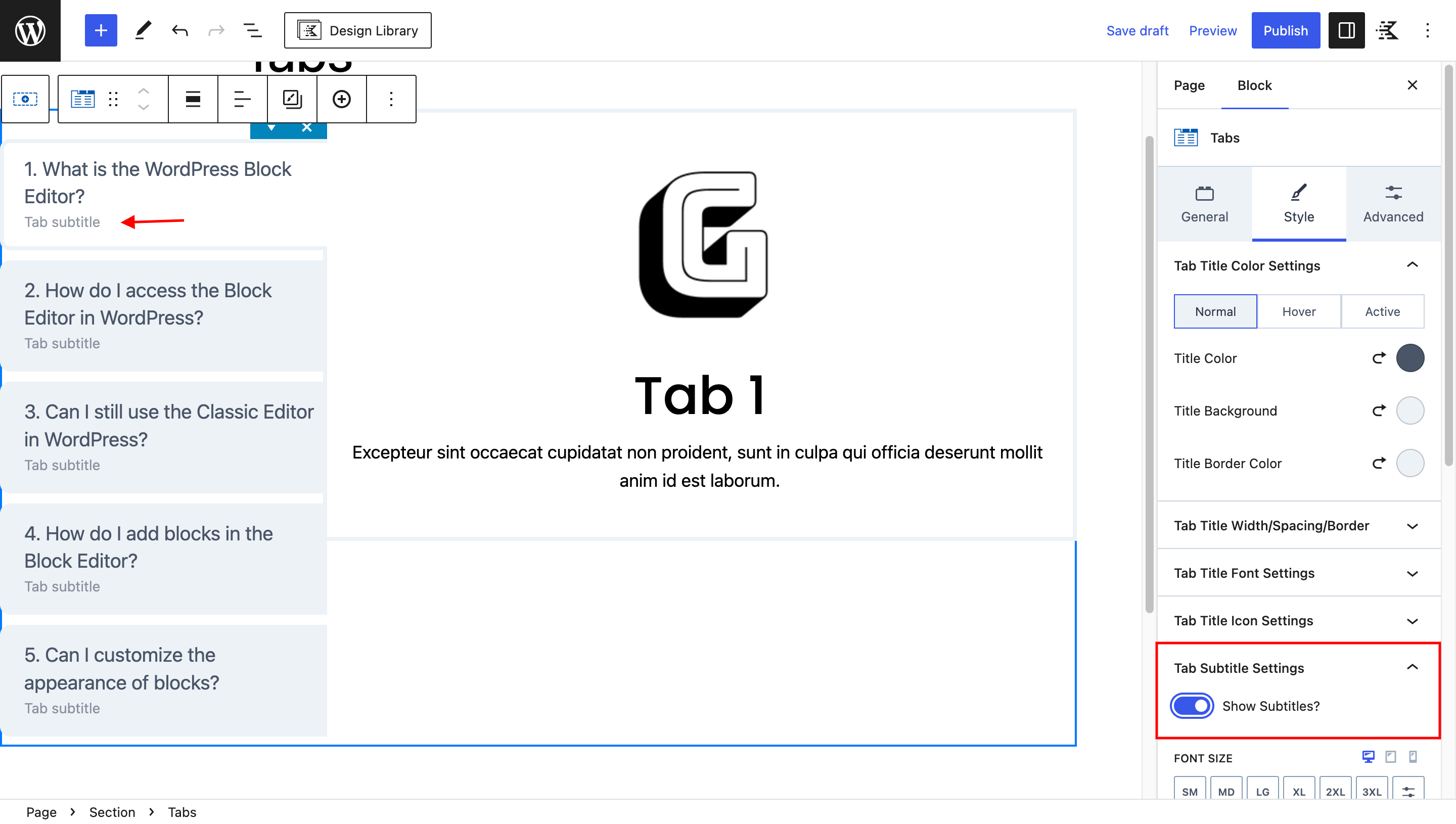
Add subtitle content for each tab menu.
Applying Custom CSS for the Collapsible Effect
You’ll need to add some custom CSS to achieve the collapsible effect.
Select the section containing the Tabs Block.
Go to “Advanced” settings and open the “Custom CSS” panel.
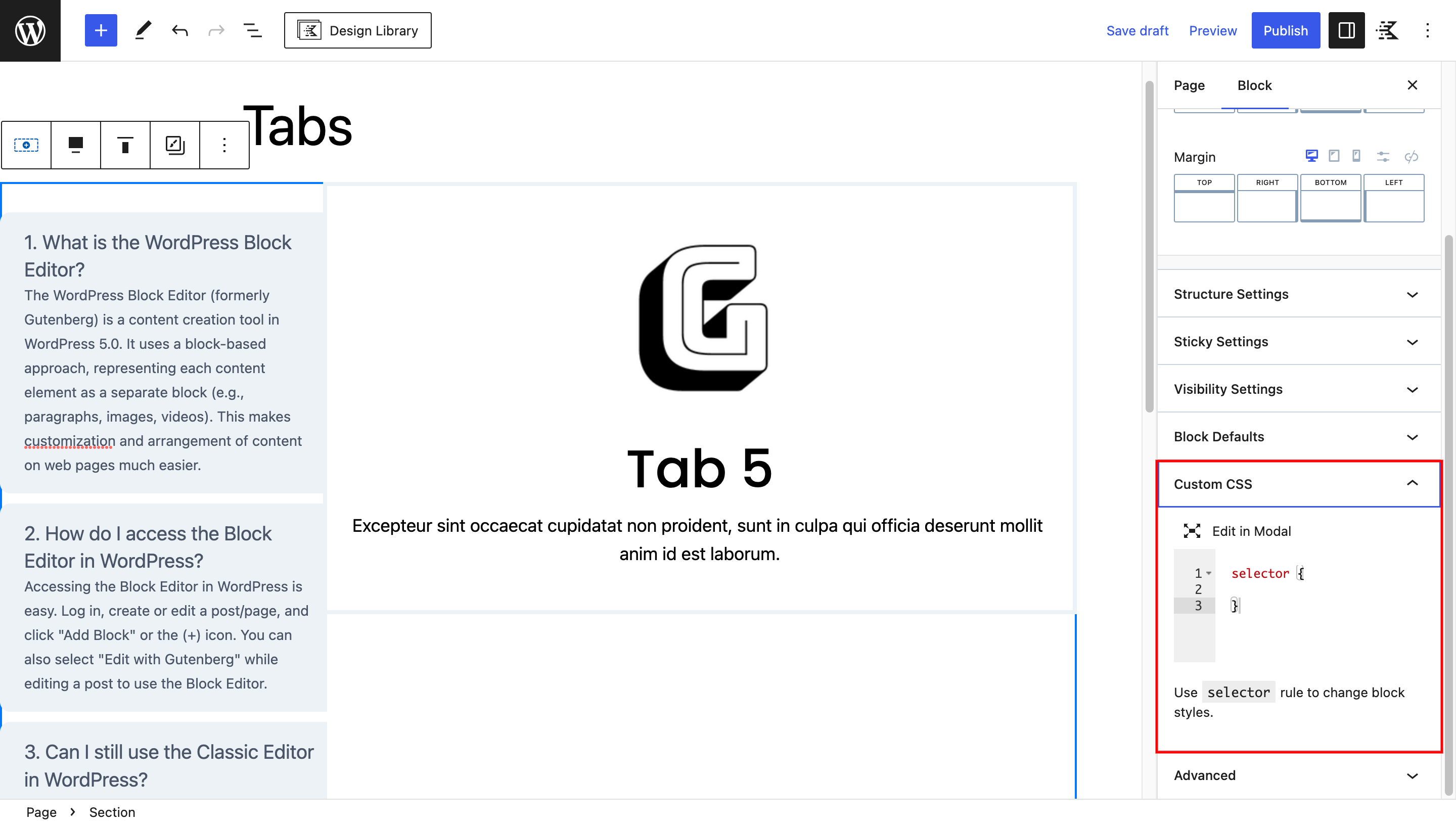
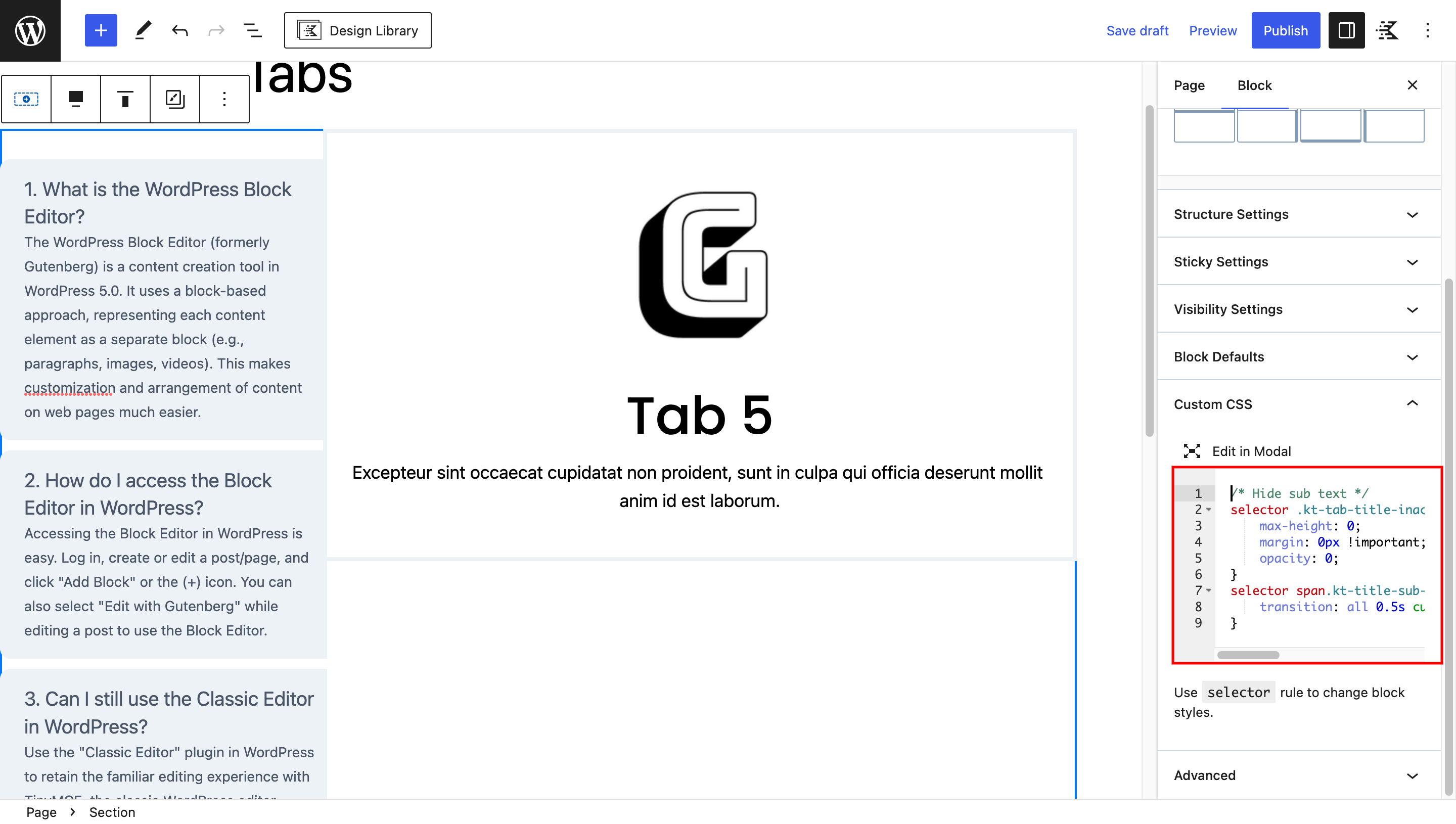
Copy and paste the following CSS code.
/* Hide sub text */
selector .kt-tab-title-inactive span.kt-title-sub-text {
    max-height: 0;
    margin: 0px !important;
    opacity: 0;
}
selector span.kt-title-sub-text {
    transition: all 0.5s cubic-bezier(.4, .63, .57, 1), visibility .3s step-end;
}
Great job! Your tab menu can now turn into collapsible. Remember, this might not show up in the editor. To see it in action, preview your page.
Additional Styling (Optional)
If desired, you can switch the tab direction, vertically center the content, adjust the spacing, and make the tabs menu and content equal width using additional CSS code.
selector .kt-tabs-wrap {
    flex-direction: row-reverse; /* Switch Direction */
    align-items: center;  /* Vertical Align */
    gap: 50px; /* Space Between */
}

selector ul.kt-tabs-title-list, selector .kt-tabs-content-wrap {
    flex: 1 !important; /* Edual Width */
}
To make your collapsible tabs design same as demo on the top, follow these steps.
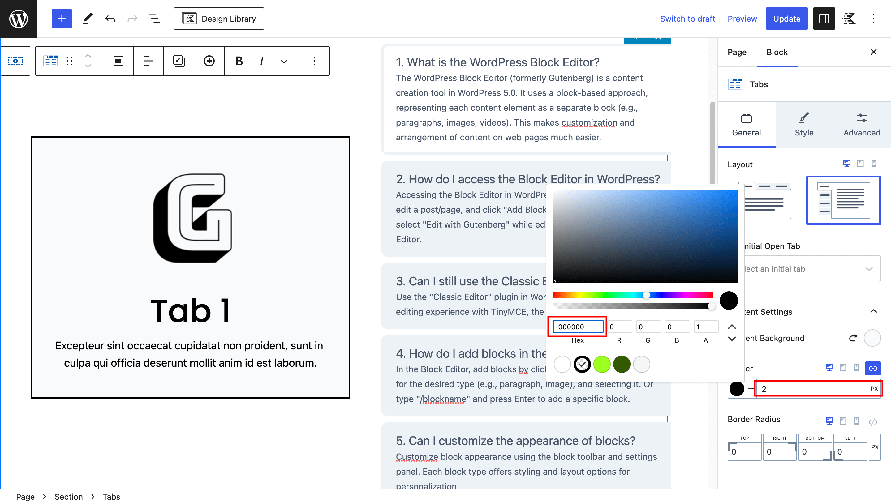
Select the Tabs Block and change the content background color to #F7FAFC.
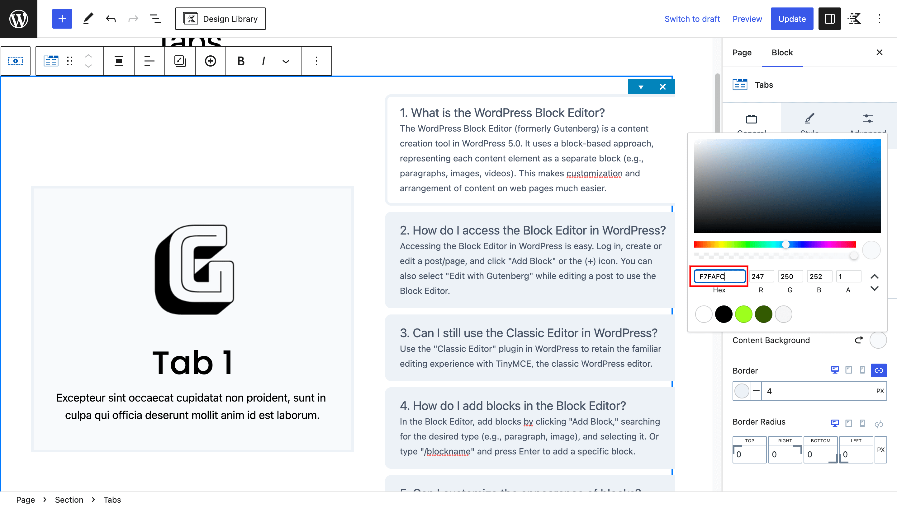
Add a 2px solid black border to the Tabs Block, providing a polished separation from the surrounding content.
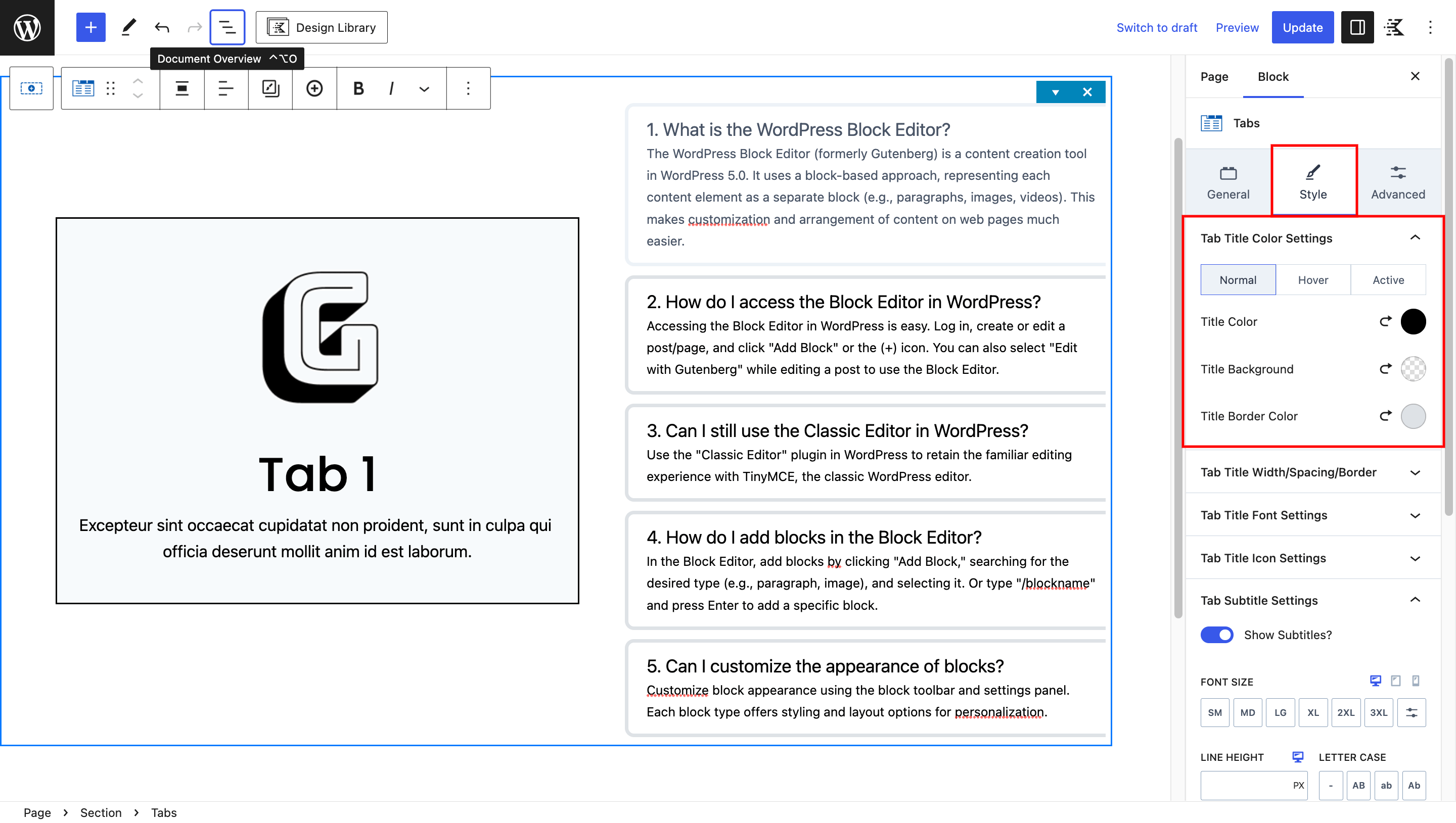
In the “Style” tab.
Set the title color to black, background color transparent, and border color #DEE2E6.
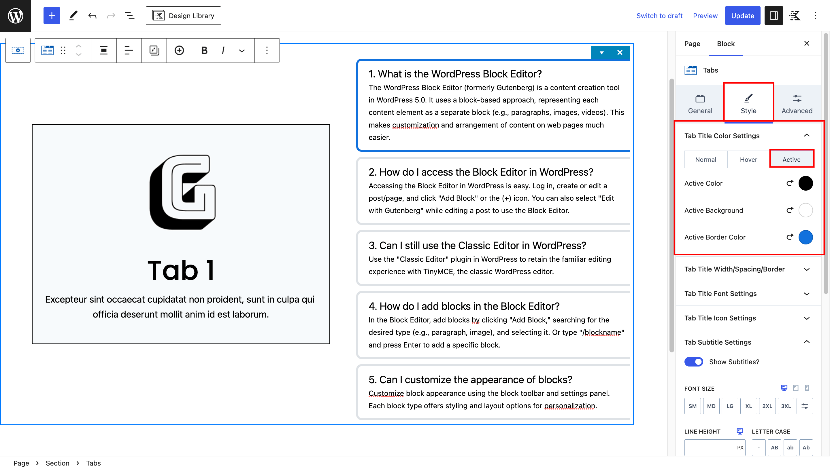
Set the active title color to black, background color white and active title border color #1171DD.
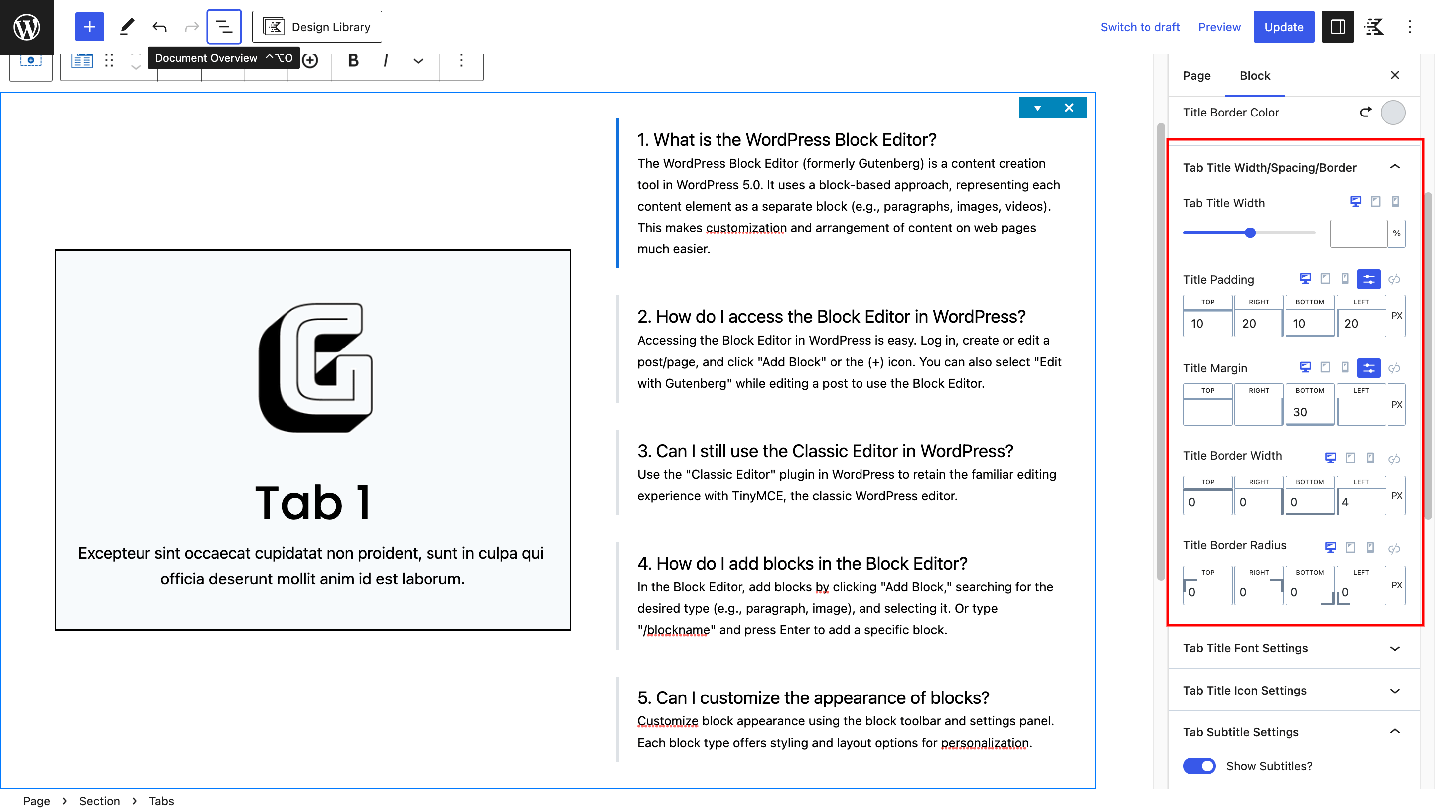
Fine-tune the spacing and borders in the “Title Width/Spacing/Border” pannel.
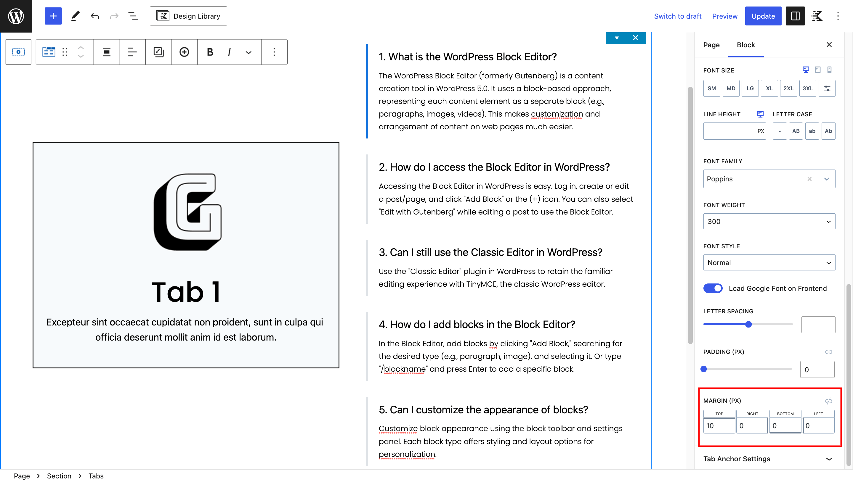
In the “Tab Subtitle” settings.
Try out different font sizes, families, and weights to make subtitles easy to read.
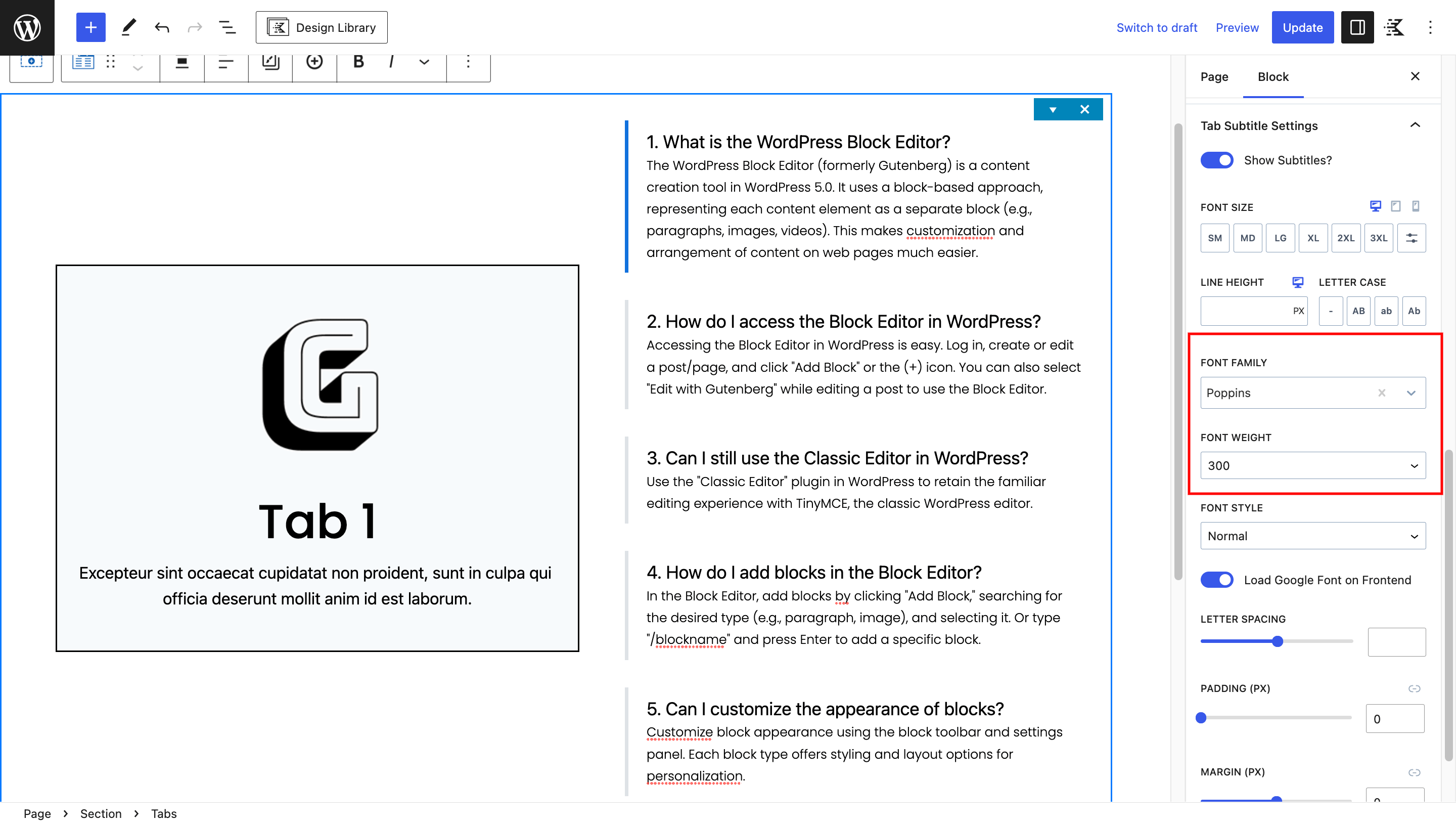
Add a bit of space above the subtitles to keep things neat.
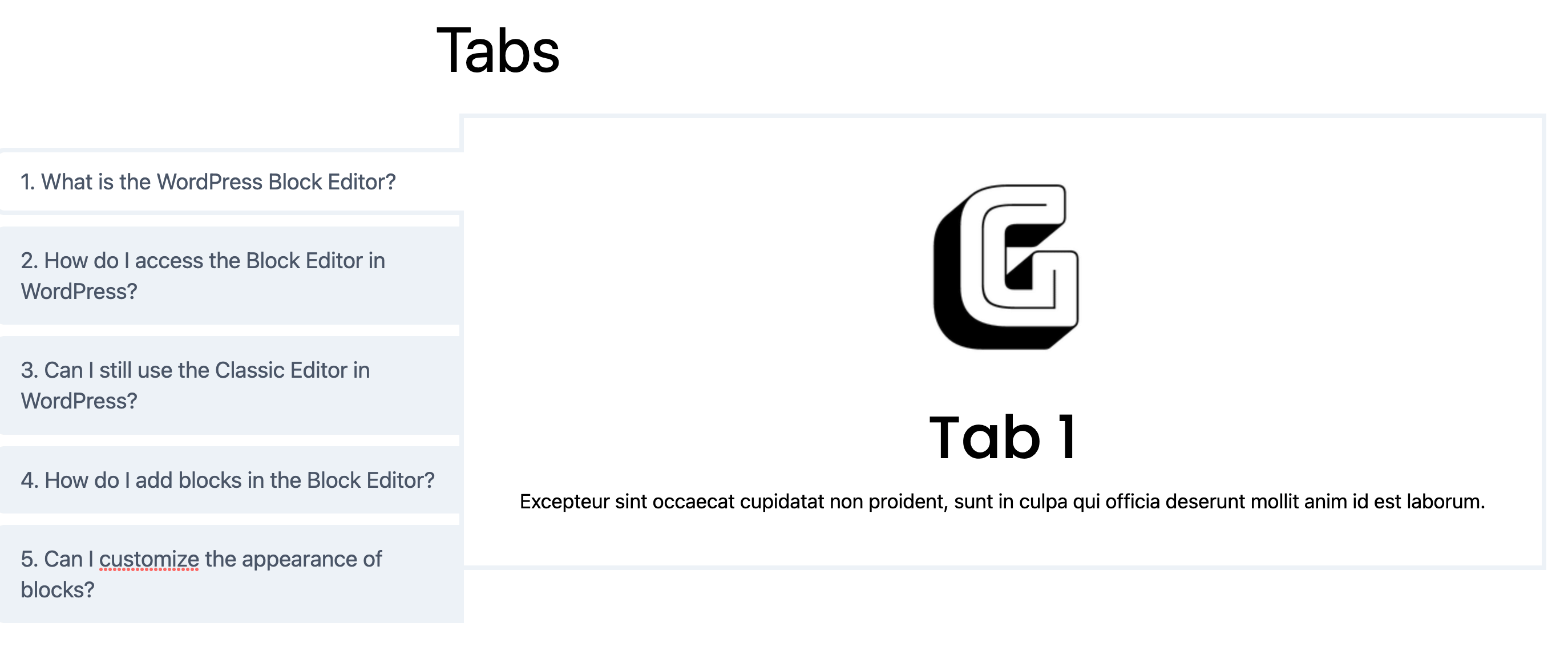
Final Result
By following these step-by-step instructions, you’ll successfully create an engaging collapsible tabs menu using Kadence Blocks. The combination of default block features and custom CSS empowers you to seamlessly transition from traditional tabs to an interactive accordion-style layout.


Leave a Reply