In this tutorial, we will create a nice Flip Card / Flip Box in Gutenberg without any extra plugin.
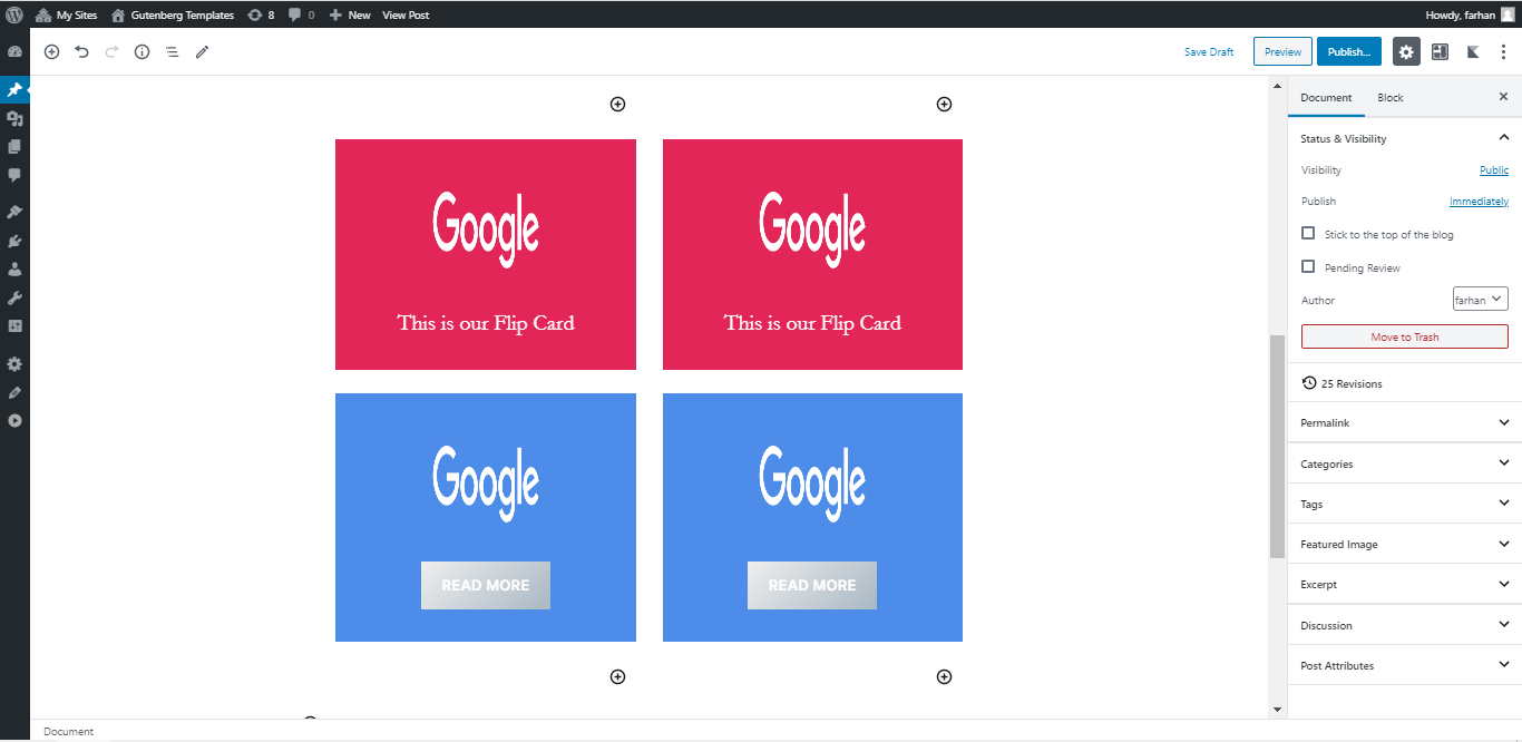
Here is a sneak peek of the final result.

For the sake of this tutorial, we will create two flip cards that flip in different directions.
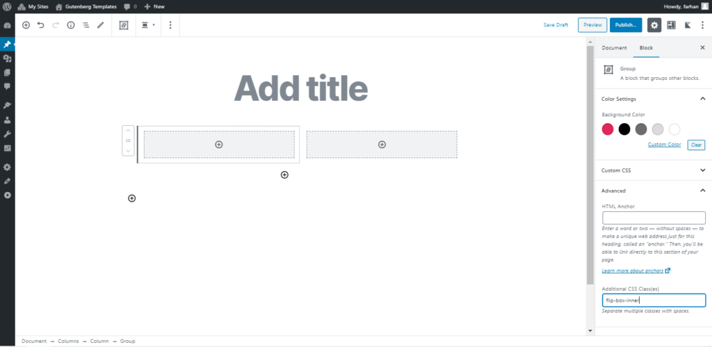
Let’s add a column block with two columns and assign a CSS class flip-box to the column.
Next, add a Group Block inside that column and assign a CSS class flip-box-inner to this group.
Add another group block inside that Group block we just added and assign a CSS class flip-box-front to this group.
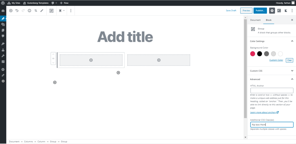
Now you can add your front side content using any Gutenberg blocks inside the group block having CSS class flip-box-front which we just created earlier.
For this tutorial, we will add an image and a paragraph.
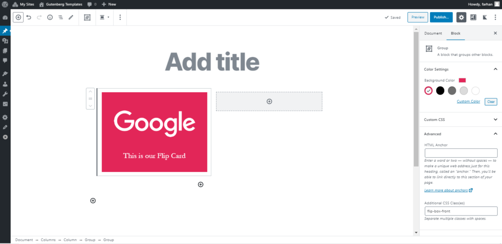
This is how our front side of the flip card looks, we just added some content and background color to the front side group block.
Now we need to create the flip card’s backside content.
For this, we will simply duplicate the front side group block. We will change its CSS class to flip-box-back and update the content.
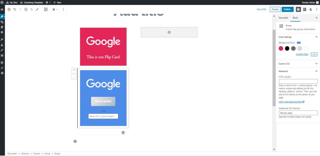
As you can see we now have the front-side and back-side content ready.
Now it’s time to add some magic CSS which creates the Flip Card effect.
.flip-box {
  perspective: 1000px;
}

.flip-box-inner {
  position: relative;
  transition: transform 0.8s;
  transform-style: preserve-3d;
}

.flip-box:hover .flip-box-inner {
  transform: rotateX(180deg);
}

.flip-box-front, .flip-box-back {
  position: absolute;
  width: 100%;
  height: 300px;
  backface-visibility: hidden;
}

.flip-box-back {
  transform: rotateX(180deg);
}
That’s it! You have created a nice flip card using Gutenberg default blocks. The current flip card flips horizontally, you can also create a flip card that flips vertically. Let’s learn how to do that.
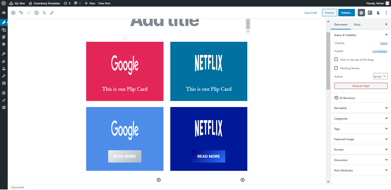
Vertical Flip Card
Making a vertical flip card effect is easy. Let’s duplicate the horizontal flip card we just created.
Make some changes in the vertical flip card if you need it. I will just replace the logo images and change colors for the demo.
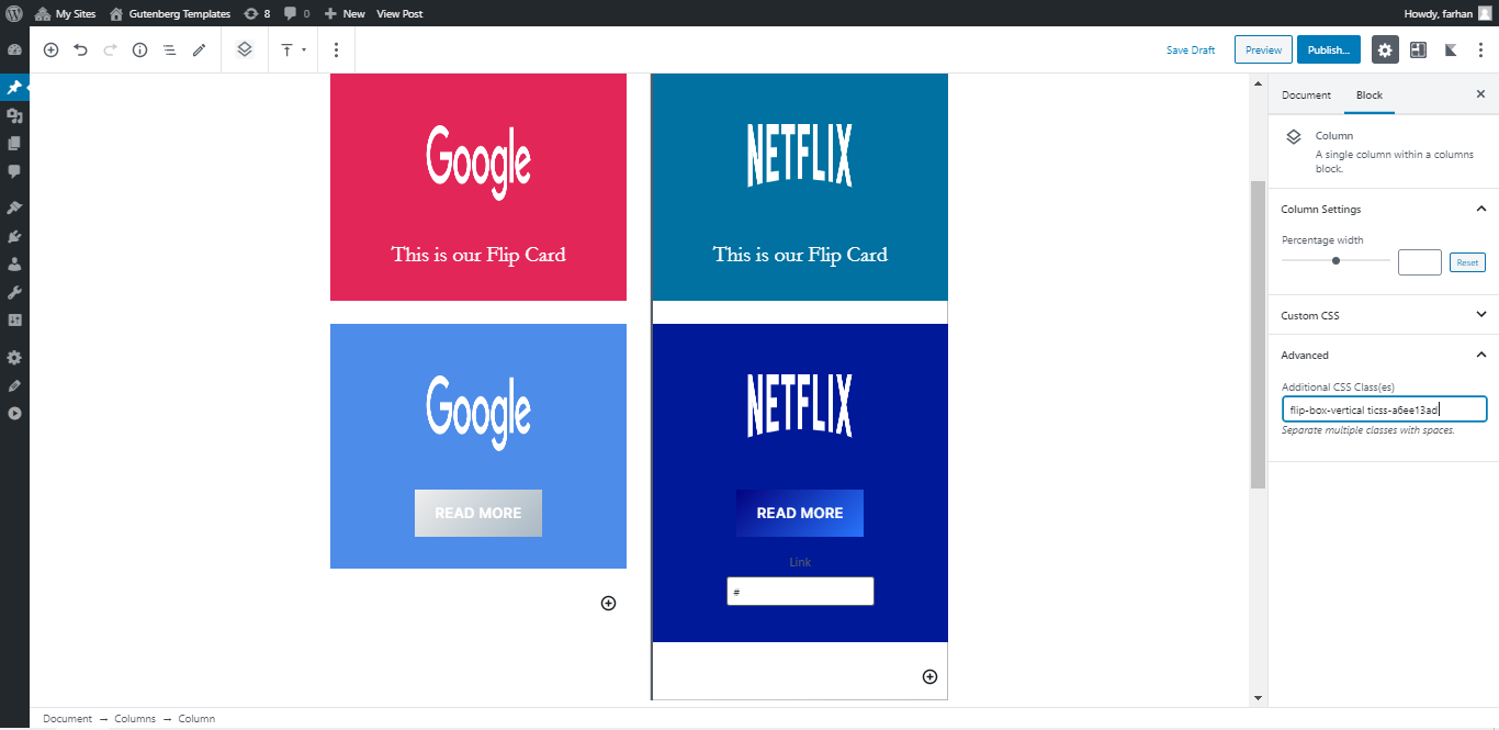
Now assign a CSS class flip-box-vertical to this column.
Now we just need to update our CSS code to apply a vertical flip card effect. We simply need to adjust the transform property in the code from rotateX to rotateY and that will change the rotation direction from horizontal to vertical.
Here are the two lines of code we will adjust to our previous code.
.flip-box-vertical:hover .flip-box-inner {
   transform: rotateY(180deg);
}
.flip-box-vertical .flip-box-back {
   transform: rotateY(180deg);
}
And here is the complete code for the Vertical Flip card effect for you.
.flip-box-vertical {
  perspective: 1000px;
}

.flip-box-inner {
  position: relative;
  transition: transform 0.8s;
  transform-style: preserve-3d;
}

.flip-box-vertical:hover .flip-box-inner {
  transform: rotateY(180deg);
}

.flip-box-front, .flip-box-back {
  position: absolute;
  width: 100%;
  height: 300px;
  backface-visibility: hidden;
}

.flip-box-vertical .flip-box-back {
  transform: rotateY(180deg);
}
That’s it. Easily create your custom Flip Card content in Gutenberg without any extra plugin or Javascript.
I hope you find this Gutenberg Tutorial useful and share it with others. ?


Leave a Reply