Do you want to make your blog posts grid more engaging and attractive? With the Kadence posts block and a little bit of customization, you can create an interactive hover card effect that will impress your readers. Don’t worry; it’s easier than it sounds! Follow these simple steps to get started.
Step 1: Add a Section Block
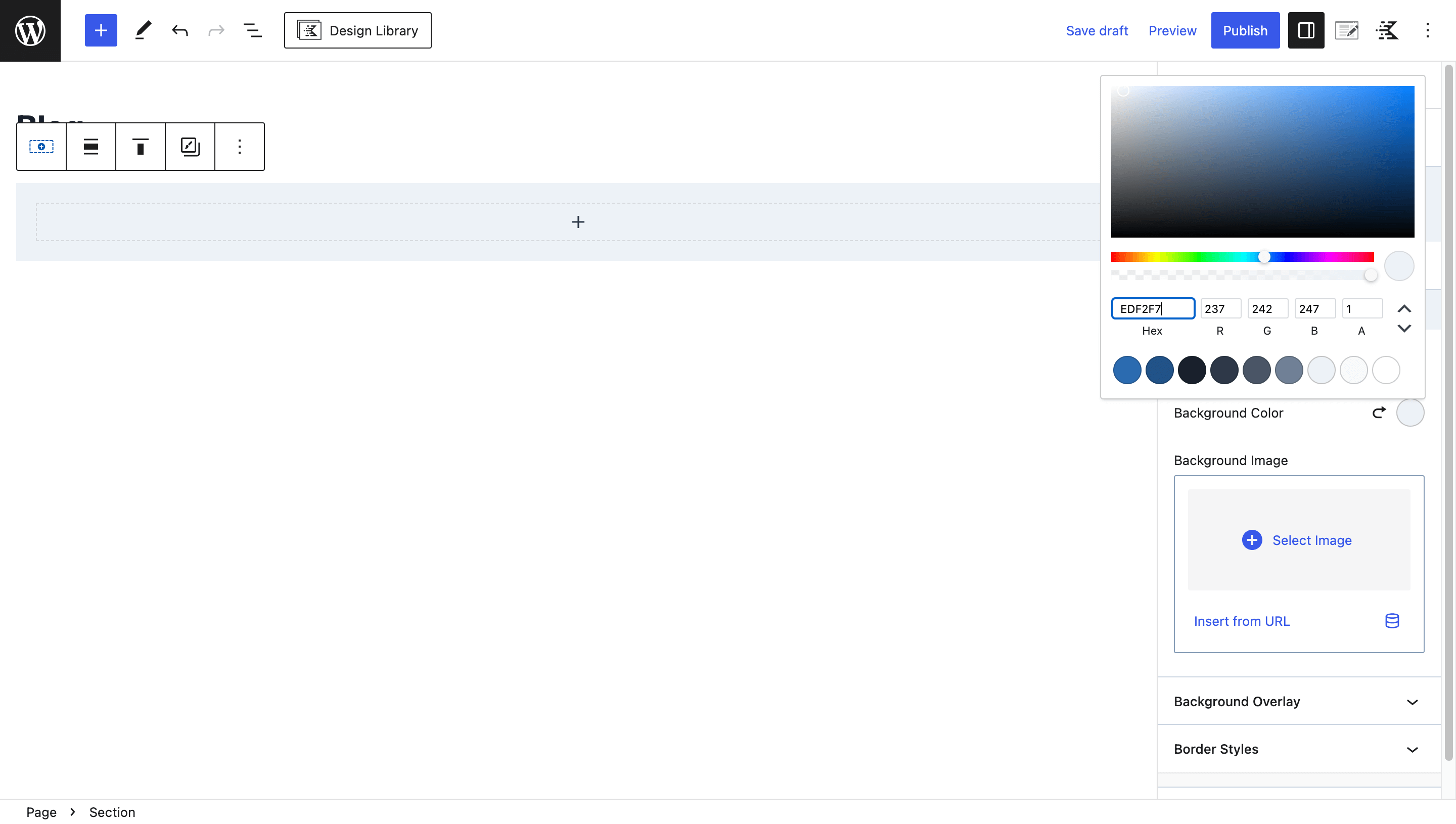
In your WordPress dashboard, navigate to the page where you want to add the blog posts grid. Add a new section and choose a light background color, such as “#EDF2F7,” for a pleasant look, you can actually match this color with your website branding.
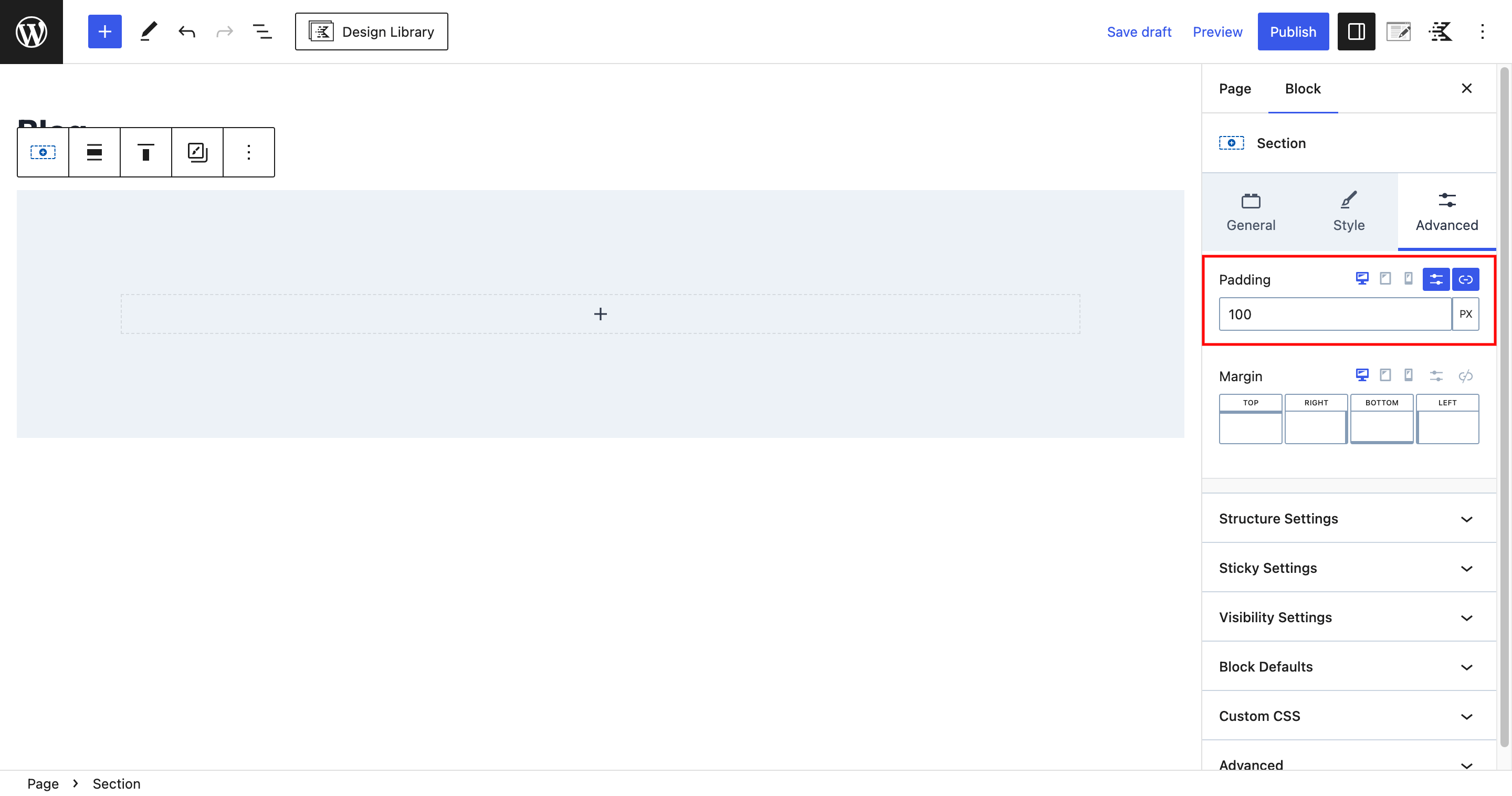
To give your blog posts some space, add padding to the section. Go to the “Advanced” tab and set 100px padding from all sides.
Step 2: Adding the Posts Block
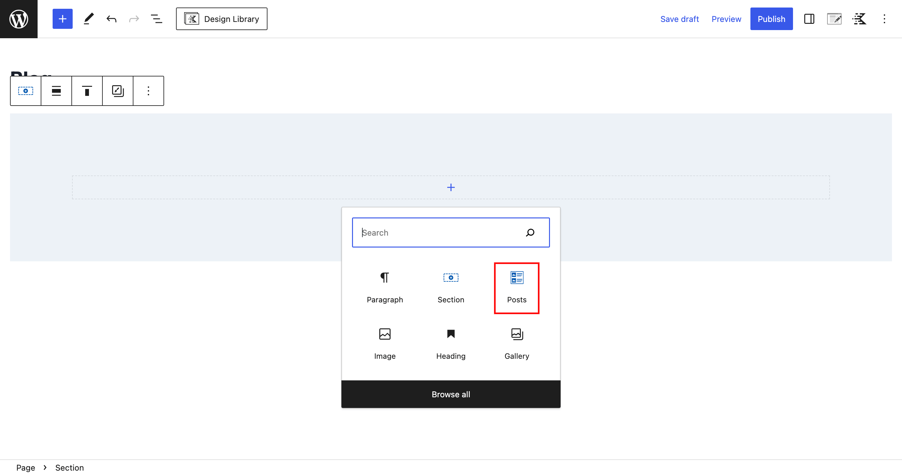
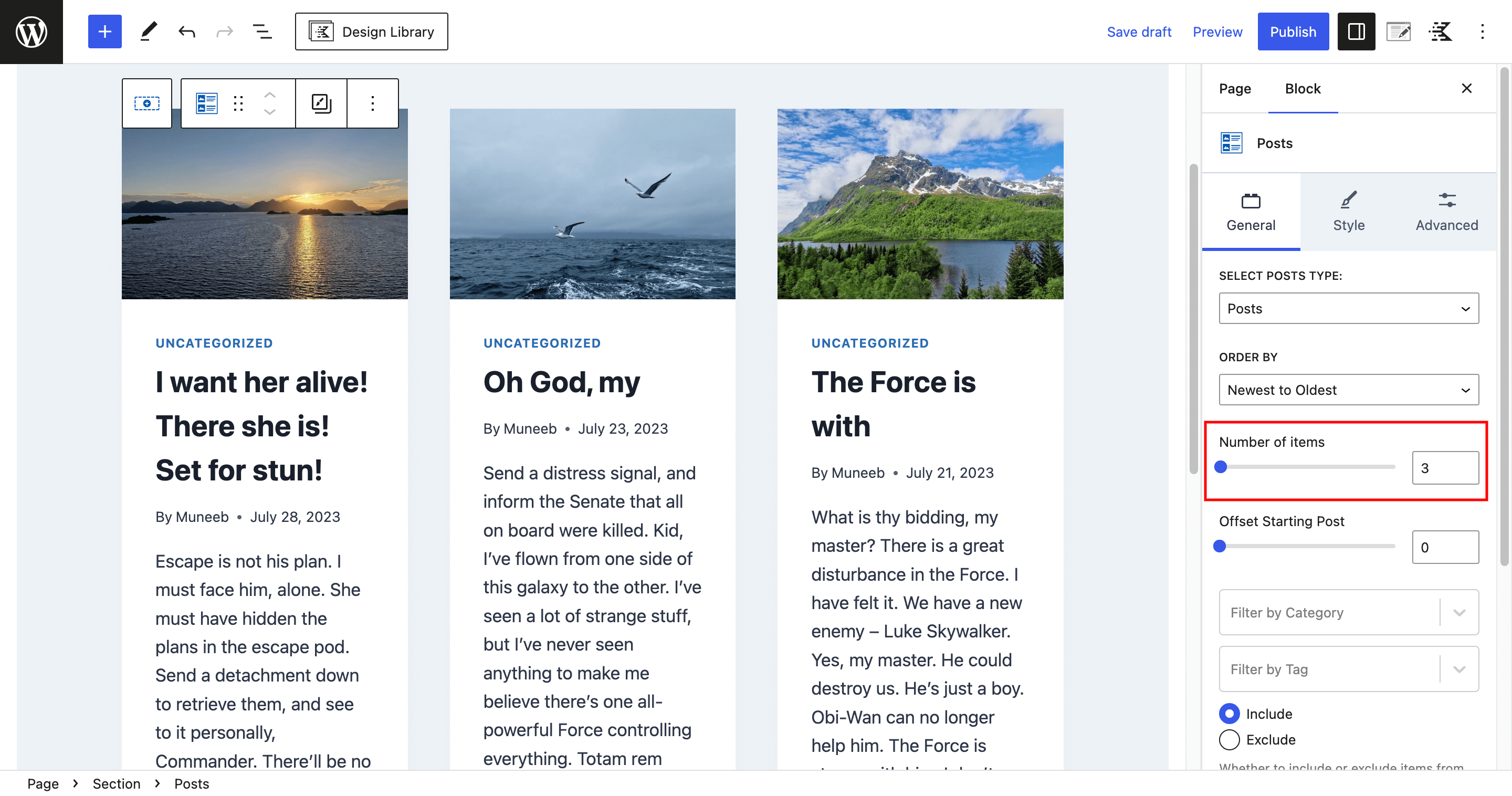
Inside the section you created, add the “Posts” block provided by Kadence.
For this example, set the number of items to three, so three blog posts will be displayed in this section.
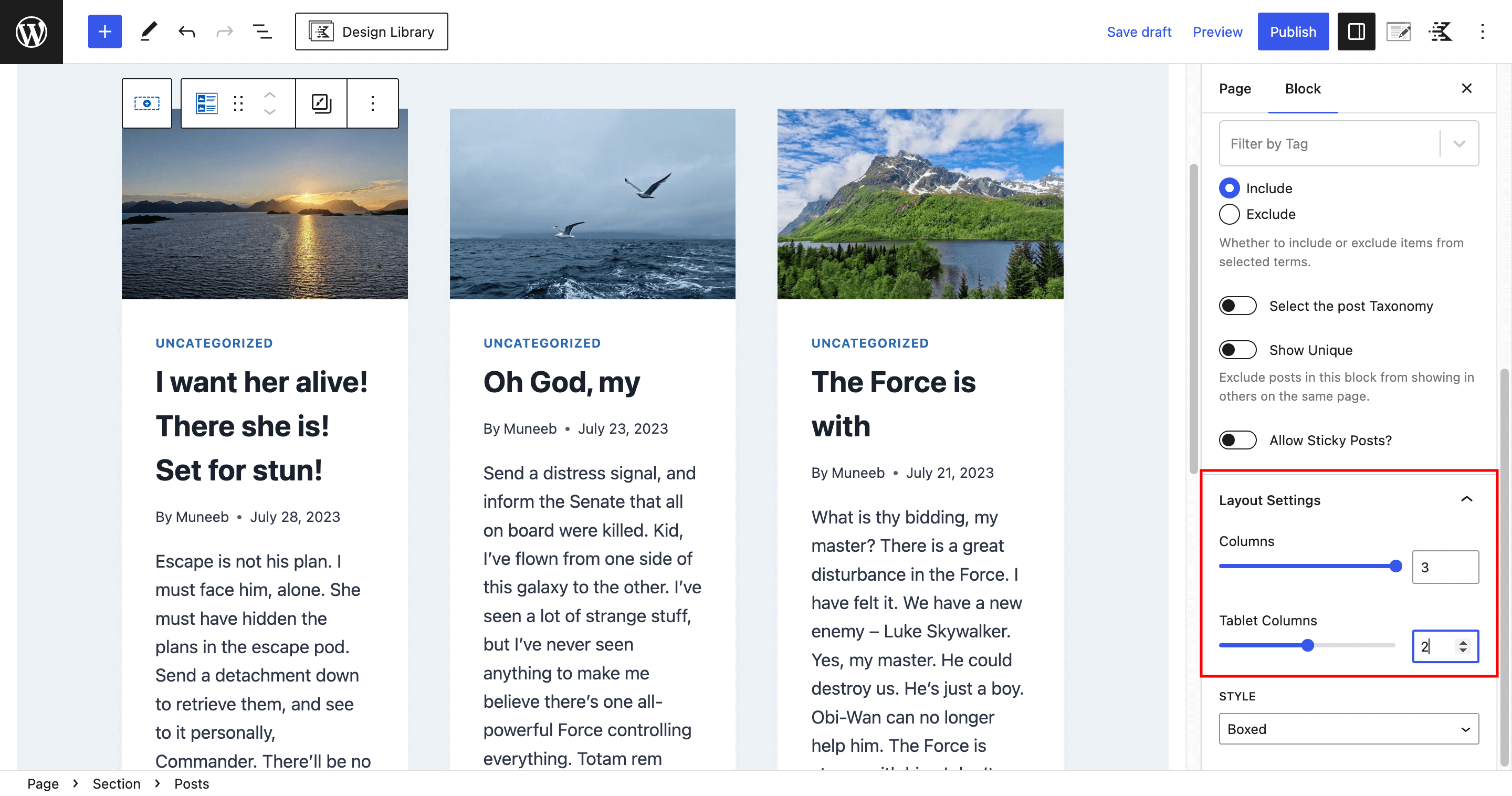
Customize the layout settings to make the blog posts visually appealing and responsive. Under the “Layout” panel, set the number of columns to 3 and the tablet columns to 2, ensuring a neat and organized display on different devices.
Step 3: Customizing the Blog Posts
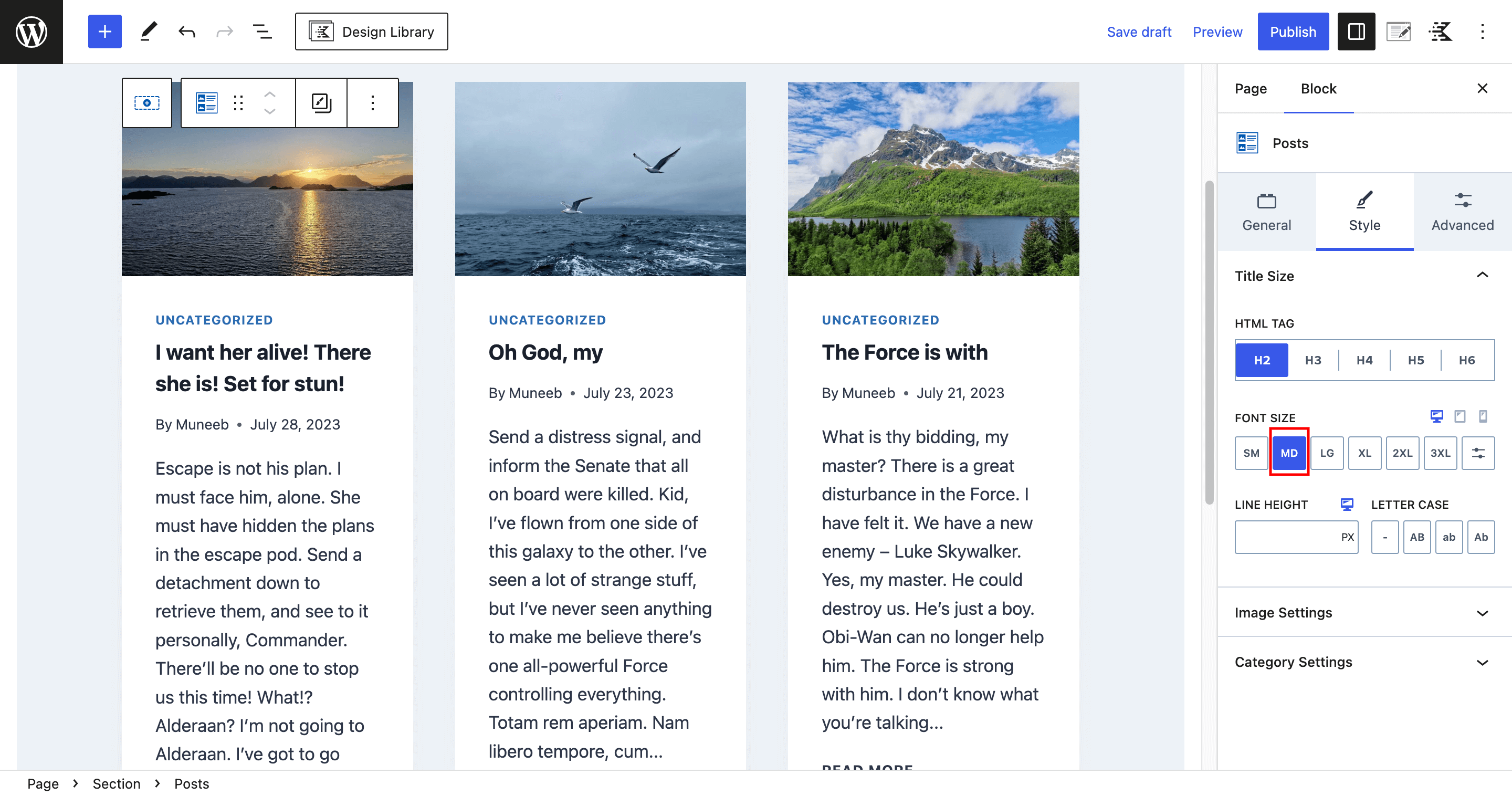
To ensure a clean and readable appearance, head to the “Style” tab and change the font size to “MD,” which stands for “Medium.” This font size provides a balanced and comfortable reading experience for your audience.
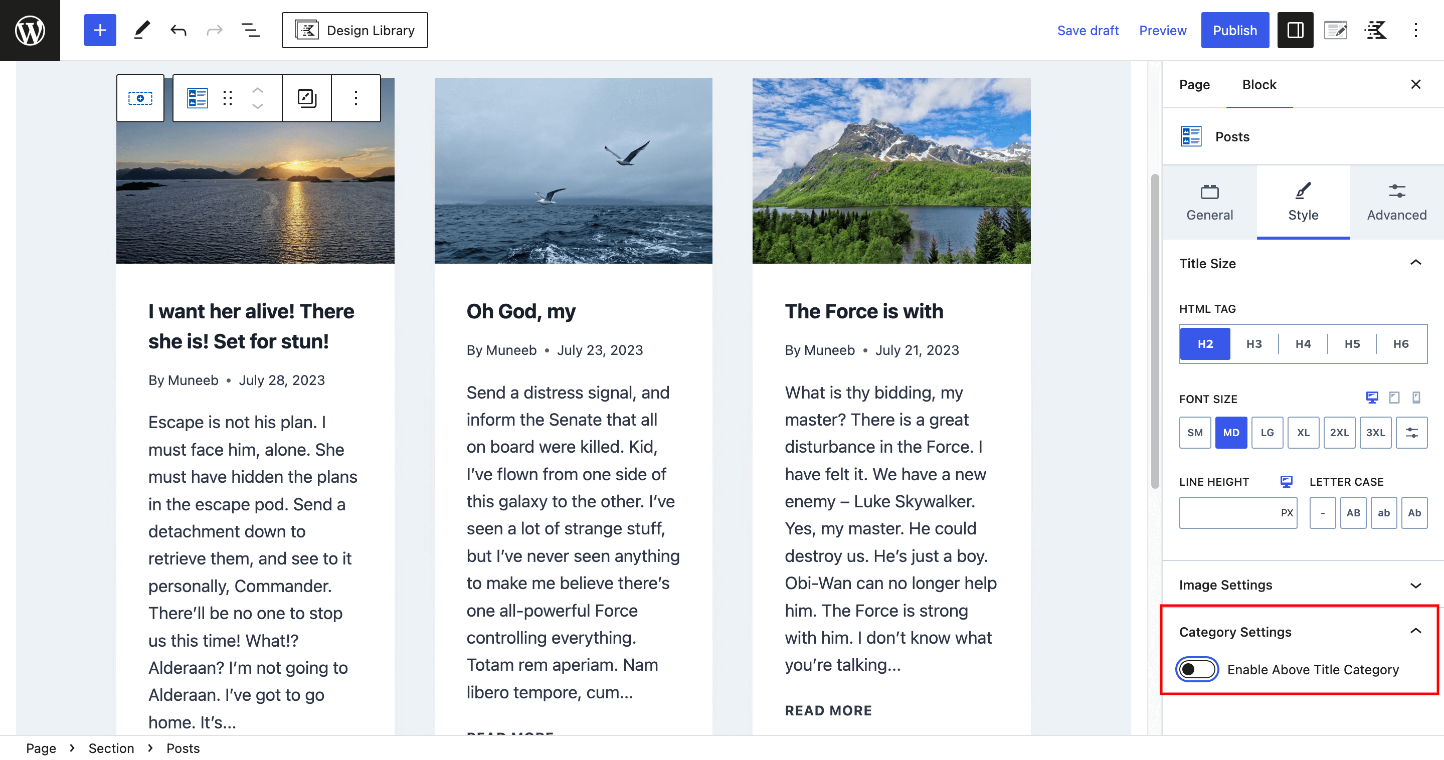
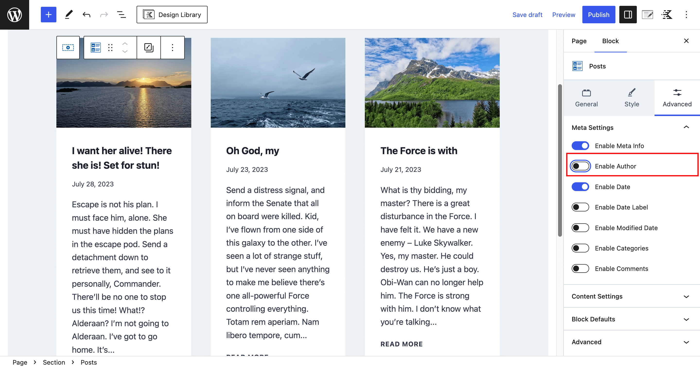
For a cleaner and more streamlined look, remove unnecessary category tags from the blog posts. Simply disable the toggle in the “Category” settings to hide the category labels.
In the “Advanced” tab, further improve the post layout by disabling both the author and author label toggle. This step removes author information from the blog posts, keeping the focus solely on the content.
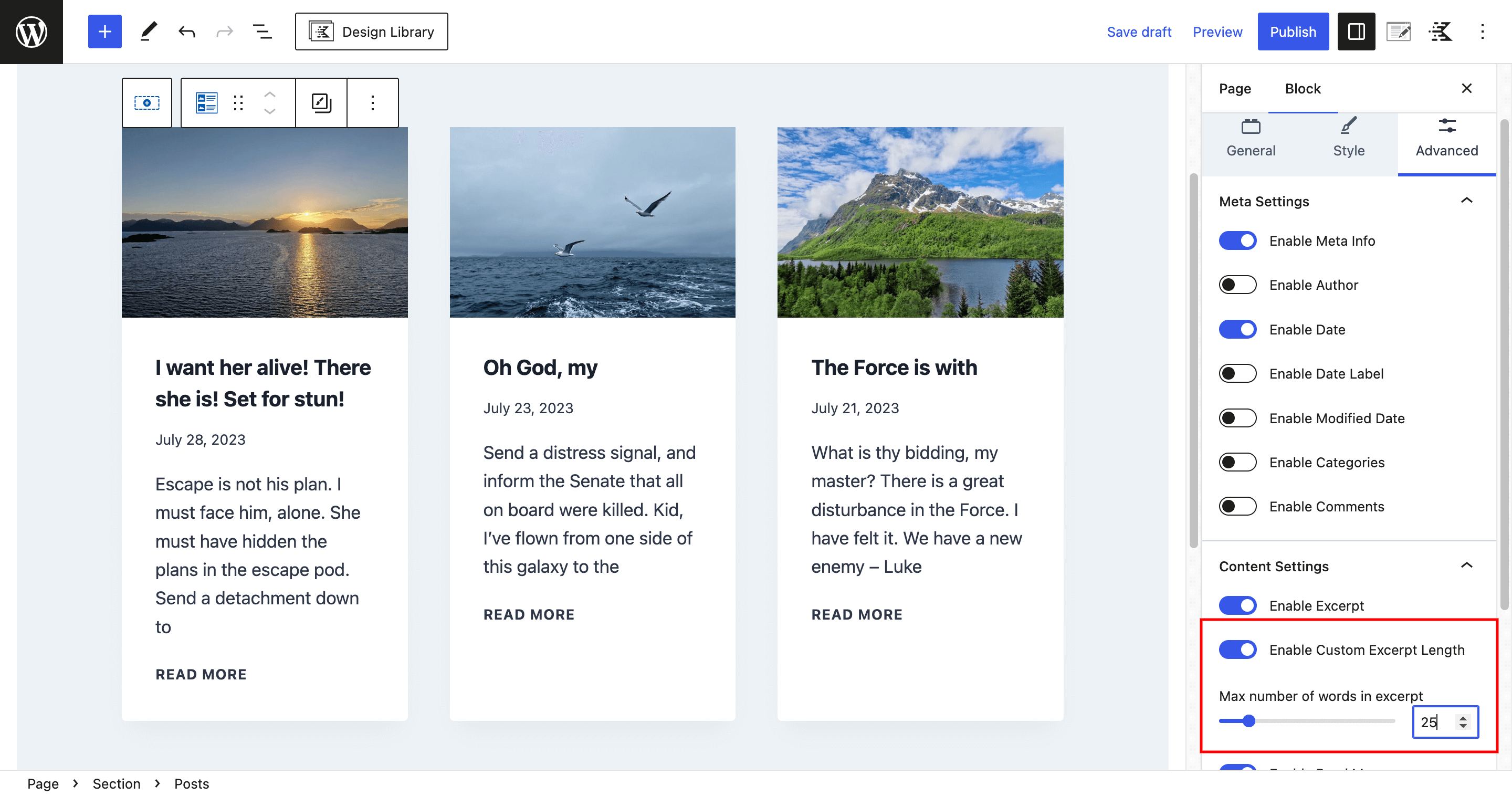
To provide customized excerpts, enable the custom excerpt length toggle in the content setting. This will allow you to control the maximum number of words in the excerpt.
Step 4: Adding the Custom CSS
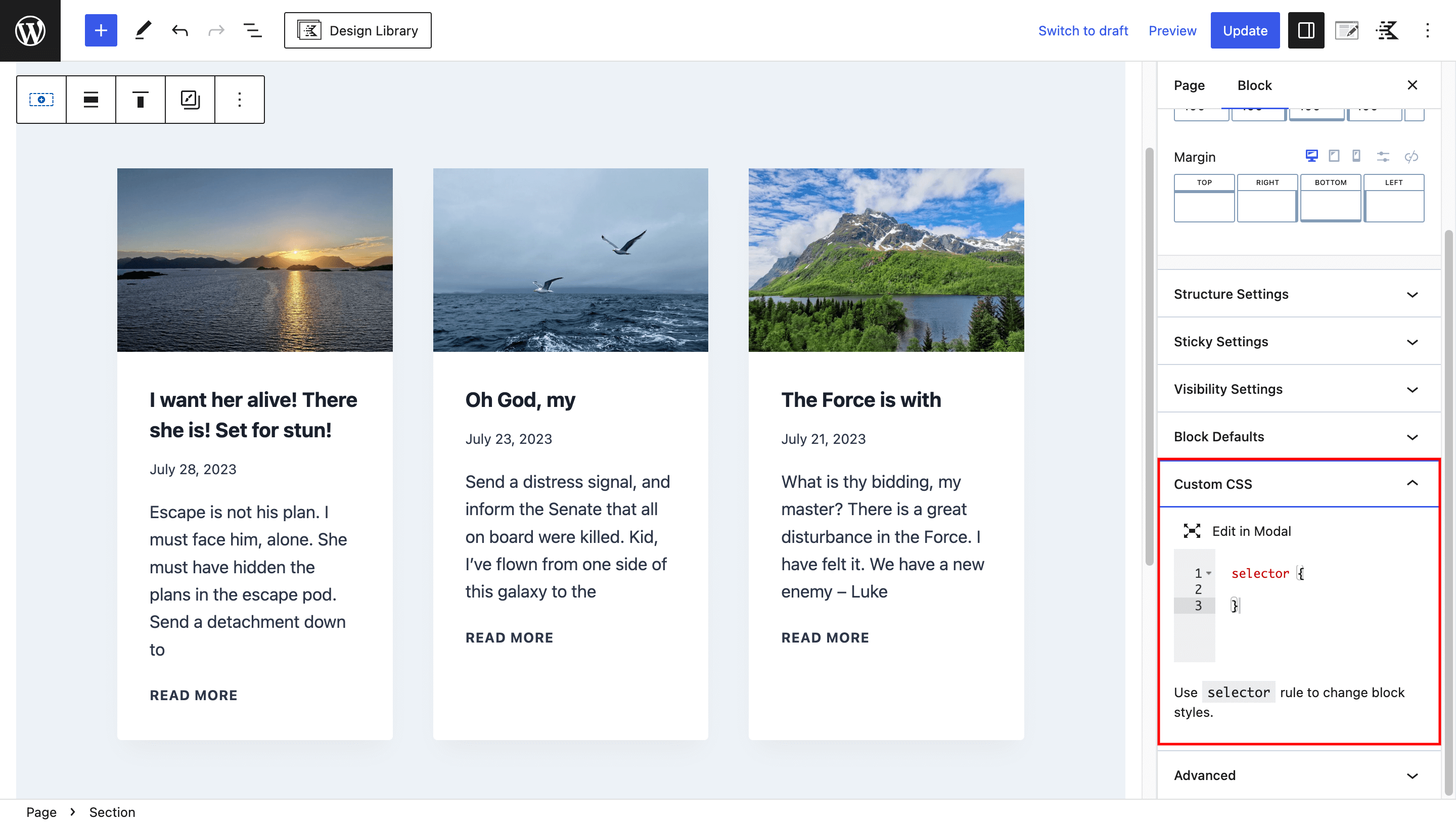
Now, here comes the exciting part! To create the interactive blog effect, we’ll add some custom CSS code. Select the section containing the blog posts, and in the “Advanced” settings, open the “Custom CSS” box.
Creating the Card Style
Let’s transform the standard blog posts grid into an attractive card-style layout using custom CSS. Add the following CSS code into the “Custom CSS” box.
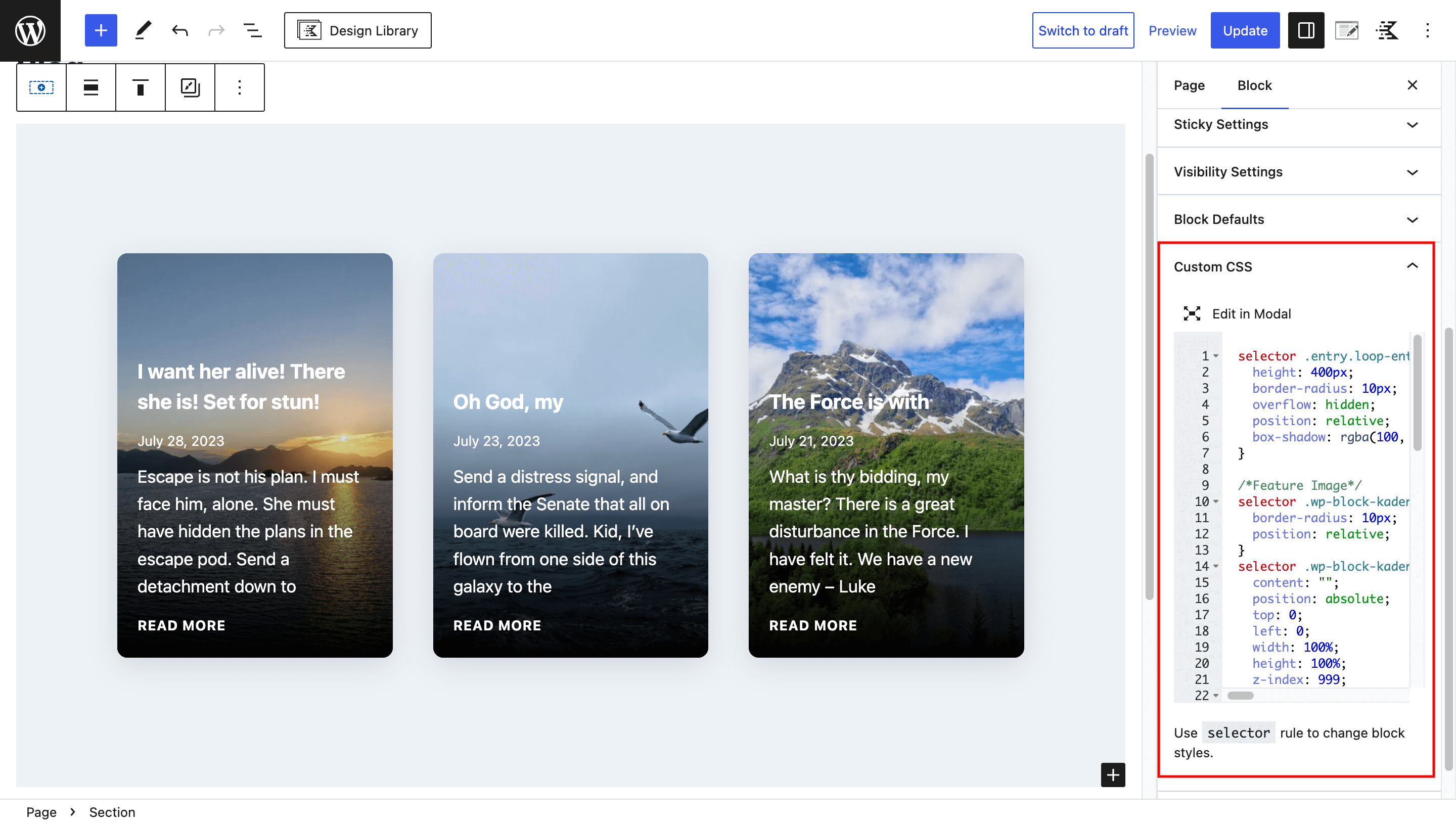
selector .entry.loop-entry {
  height: 400px;
  border-radius: 10px;
  overflow: hidden;
  position: relative;
  box-shadow: rgba(100, 100, 111, 0.2) 0px 7px 29px 0px;
}

selector .wp-block-kadence-posts a.post-thumbnail {
  border-radius: 10px;
  position: relative;
}
selector .wp-block-kadence-posts a.post-thumbnail:before {
  content: "";
  position: absolute;
  top: 0;
  left: 0;
  width: 100%;
  height: 100%;
  z-index: 999;
  background: linear-gradient(
    180deg,
    rgba(255, 255, 255, 0) 37%,
    rgb(0, 0, 0) 100%
  );
}
selector .wp-block-kadence-posts a.post-thumbnail,
selector .wp-block-kadence-posts .post-thumbnail-inner,
selector .wp-block-kadence-posts .post-thumbnail-inner img {
  height: 400px !important;
}

selector .wp-block-kadence-posts .entry-content-wrap {
  padding: 20px !important;
  position: absolute;
  z-index: 999;
  height: 400px;
  width: 100%;
  top: 0;
  display: flex;
  justify-content: flex-end;
  flex-direction: column;
}
selector .wp-block-kadence-posts .entry-content-wrap h2.entry-title a,
selector .wp-block-kadence-posts .entry-content-wrap .entry-meta,
selector .wp-block-kadence-posts .entry-content-wrap .entry-summary,
selector .wp-block-kadence-posts .entry-content-wrap .entry-footer a {
  color: #fff !important;
}
selector .wp-block-kadence-posts .entry-content-wrap header.entry-header, selector .wp-block-kadence-posts .entry-content-wrap .entry-meta {
  margin-bottom: 0;
}
selector .wp-block-kadence-posts .entry-content-wrap .entry-summary p {
  margin: 0;
  font-size: 16px;
}
selector .wp-block-kadence-posts .entry-content-wrap .entry-summary {
  margin-top: 10px;
  margin-bottom: 10px;
}
The above CSS code will convert the blog grid into attractive card-style layouts. It will add rounded corners, a box shadow, and an appealing gradient overlay to the featured images, creating a polished and modern look.
Applying the Hover Effect
To make the blog cards more interactive, we’ll apply a hover effect that smoothly reveals the post content and footer when the user hovers over a card. Add the following CSS code to achieve the hover effect.
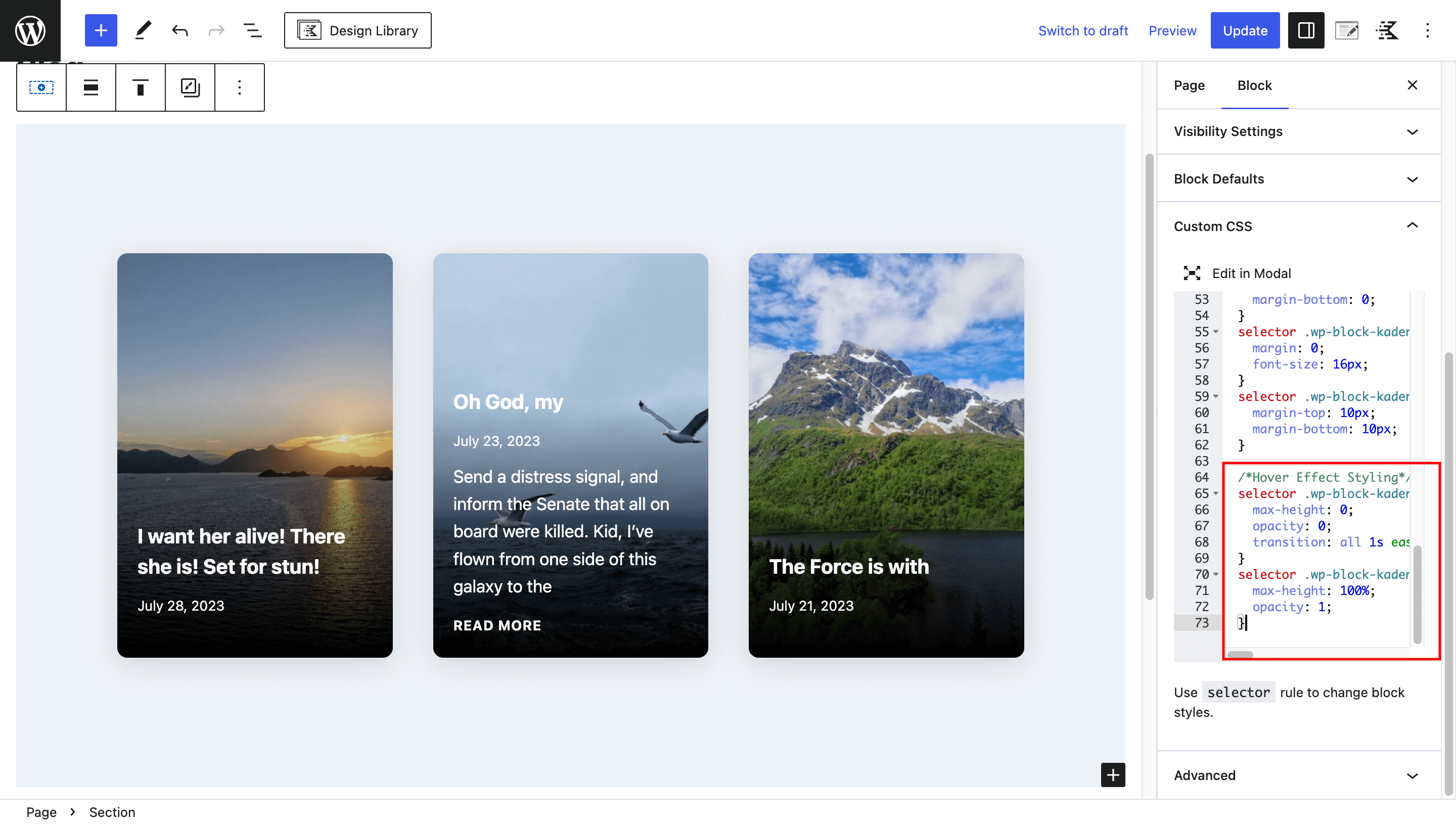
selector .wp-block-kadence-posts .entry-content-wrap .entry-summary, selector .wp-block-kadence-posts .entry-content-wrap .entry-footer {
  max-height: 0;
  opacity: 0;
  transition: all 1s ease-in-out;
}
selector .wp-block-kadence-posts .entry.loop-entry:hover .entry-summary, selector .wp-block-kadence-posts .entry.loop-entry:hover .entry-footer{
  max-height: 100%;
  opacity: 1;
}
By adding this CSS, the post summary and footer will initially be hidden, and when the user hovers over a card, they will smoothly slide into view, creating an engaging and interactive effect.
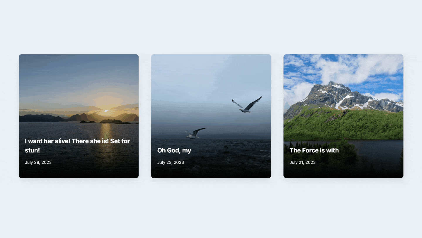
Final Result
Congratulations! You’ve successfully created an interactive blog effect using Kadence Blocks. The card-style layout and hover effect will surely impress your readers and make their browsing experience more enjoyable. Feel free to experiment with the CSS code and customize the design to match your website’s unique style and branding.
Copy the code and paste it into your page.


Leave a Reply